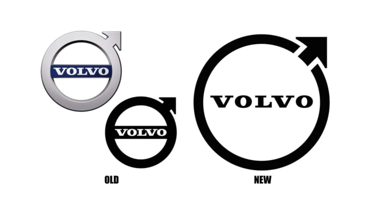
Volvo's first car debuted in 1927, bearing the Swedish automaker's now-famous "Iron Mark" logo of a circle with an arrow pointing to the upper right. For 73 of the 94 years since that Volvo OV 4 open carriage, the company's been represented graphically by four versions of a two-dimensional-looking logo, either a colorful oval that looks like a sandwich shop sign, or the Iron Mark logo, or just script. From 2000 to 2020, that Volvo cars trademark has changed four more times (plus once for Volvo trucks), Volvo creating three versions of a 3D-looking Iron Mark with a blue bar across the middle containing the script, and in 2020, changing the font of the script. Now that's it's 2021, it's apparently time for another overhaul. Visitors to Volvo's Facebook page realized Volvo changed its profile picture to a new and very flat version of its Iron Mark.
This isn't the revolution everyone's making it out to be. When Volvo debuted its last new Iron Mark in 2015, one of the Swedish ad agencies that created it wrote, "The logo has been simplified in its purest form and conveys the brand’s vision: to be the world's most progressive and desirable premium car brand." Thing is, the agencies created two versions of the logo — one in silver with three-dimensional shading that retained the blue crossbar drawn up in 2000, and another in black and white, a solid black circle and attached arrow with a black crossbar bearing white "Volvo" script. The automaker's been using the silver, shaded version everywhere the public would see it. Seems Volvo wanted something even more "simplified in its purest form," though, so it could have simply requested a tweak to the B&W version it's been sitting on for six years.
The question, "Do you like it," probably doesn't matter, because it won't stop anyone from buying the product. Besides, the Volkswagen logo went flat in 2019, Nissan went flat in 2020 and so did BMW, except that its flat roundel is for everything but its cars, and Kia went flat this year — along with Warner Brothers, Pringles UK, and Burger King, that last company seemingly trying to win an award for being plain. Simplicity in two dimensions is the thing now.
A Volvo Australia rep told Drive the rollout "will be gradual. [This week] we start by rolling out the updated identity on our main website, main social media platforms and in the new Volvo Cars mobile app. The updated Iron Mark will be rolled out in other areas step by step, and the first car with the updated Iron Mark will be launched in 2023. The old Iron Mark will be phased out over time." It's expected the coming new-generation XC90, due for reveal next year, will be the first bearer of the new logo, along with Volvo's switch to proper names instead of alphanumerics.
Related video:


Sign in to post
Please sign in to leave a comment.
Continue