We all know the state of the auto industry right now, especially with regard to the Detroit three. We'd say it's somewhere between normal and completely screwed. Sales volume has been mostly woeful, two of the Detroit automakers needed a taxpayer bailout to survive, and Chrysler has been passed around like a hot potato. Ford has more debt than Miami Beach has sand, yet the Blue Oval is considered the healthiest patient in the ICU. Beyond the cash infusion, the migration away from SUVs, and the desperate scramble for fuel efficiency, Detroit automakers have morphed, moved, cut and shrunk their way through the 21st century.
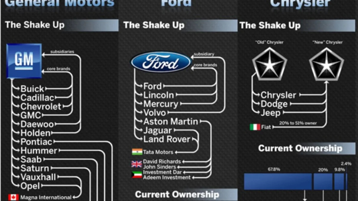
They say a picture is worth a thousand words, and we'd add that the above graph is tantamount to an engaging novella. It charts the massive brand exodus among the Detroit contingent, which looks like a quadruple reverse drawn up on the telestrator by John Madden. If that isn't sobering enough, the text below shows just how much Detroit automakers have shrunk since 2006. Overall, attrition at Ford, GM and Chrysler accounts for an astonishing 144,600 workers in only three years. No wonder Michigan has the highest unemployment rate in the nation.
The chart also gives a brief look at the up-and-coming members of the US auto industry, including Tesla, BYD, Tata and Smart, along with a quick blurb about the future of each of the automakers represented. Click on the graphic above to view the chart in full. Hat tip to M.Sharma.
[Source: Mint]

Sign in to post
Please sign in to leave a comment.
Continue