Citroen marks 90th anniversary with new logo
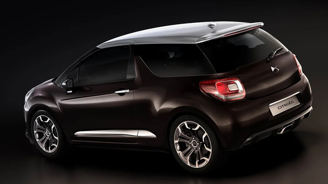
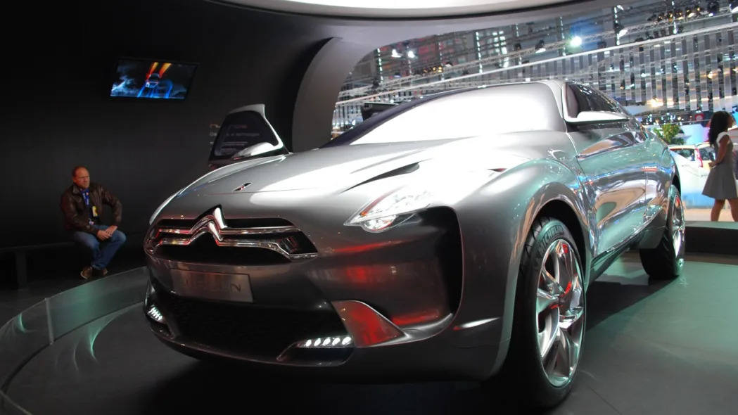
Coinciding with its 90th anniversary, Citroen is revamping its image. The new logo you see here was created by the French automaker's design and marketing departments in consultation with branding consultancy Landor. The same trademark chevrons that have always been the hallmark of Citroen's brand identity stay on duty, but in a softer form, unframed and with a three-dimensional look that's accompanied by a revised text in a deeper shade of red. But if you're thinking a new logo is all Citroen's got up its sleeves, think again and have another look at the DS3 Inside concept that will spearhead the company's new premium line at the upcoming Geneva Motor Show next month.
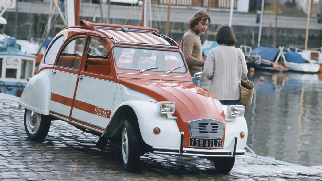
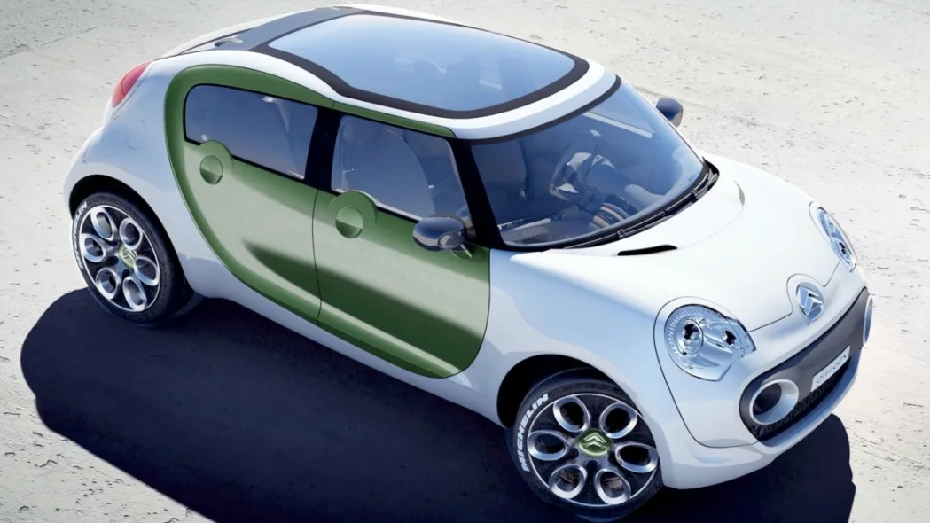
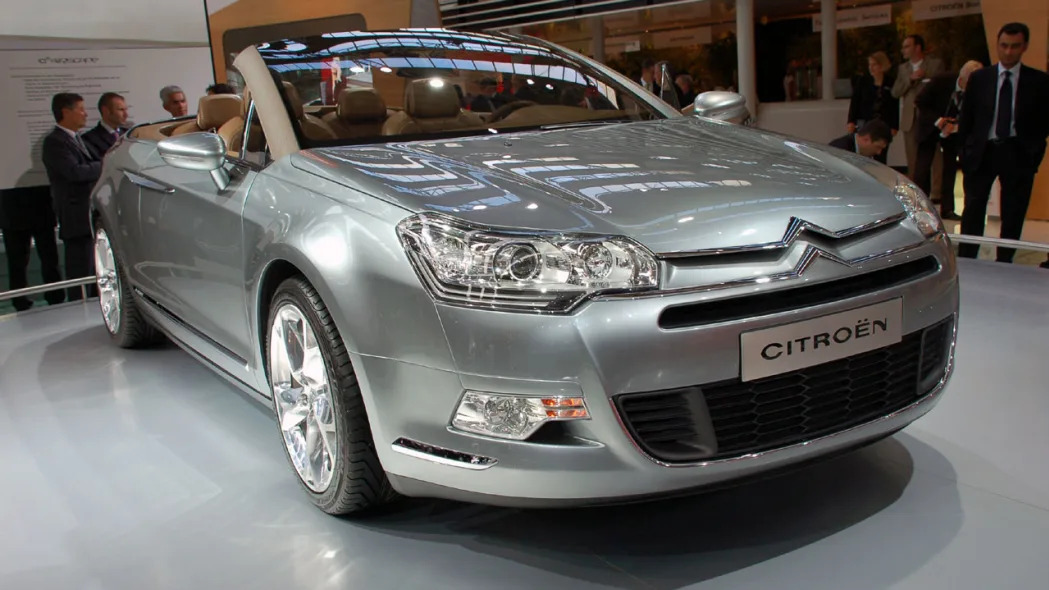
Check out the galleries below for a look back on Citroens of yesteryear and future models.


![Bugatti Bird-gate Followup: Driver identity revealed <b>[*UPDATE:</b> Now with actual crash video!]](http://www.blogcdn.com/www.autoblog.com/media/2009/11/bugatti-veyron-swim-1258147199_143x85.jpg)


Get a WordPress.com Blog


Reader Comments (Page 1 of 1)
monkeykat2 9:25AM (2/12/2009)
hmmm ... i personally like the sharper edges of the current logo.
Reply
Hank Fidel 10:03AM (2/12/2009)
I don't see why they wouldn't wait another decade to change it for their 100th Anniversary..
Rocketboy 9:58AM (2/12/2009)
As do I. This looks generic auto/aero ish. The sharper corners is a nice call-back to their early days as a gear maker.
dukeisduke 11:14AM (2/12/2009)
I agree; this new one is too wimpy.
Rick 10:24AM (2/12/2009)
I can't wait for Ford, Chevy, Chrysler and other domestic brands to re-do their MASSIVE and excessively complicated logos smaller, cleaner and more contemporary.
Reply
AZZO45b 11:29AM (2/12/2009)
A Ford Oval with classic script is "complicated"? A ram's head? Wings with a quazi-historical badge?? As much as I think the current Chevy bowtie & its nasty, bling gold looks bad... the bowtie SHAPE is far from "excessively complicated"
Chaz 10:36AM (2/12/2009)
Reminds me of the Cactus
Reply
dukeisduke 11:16AM (2/12/2009)
They're supposed to be chevrons. Chevrons don't look like that. Epic fail.
Reply
Galley 12:26PM (2/12/2009)
Yeah, they look more like space-age boomerangs.
Samurai Jack 1:50PM (2/12/2009)
Marine Boy called. He wants his boomerang back.