Editor's Note: Translogic is excited to see that new automotive technology has prompted government regulators to reconsider the venerable fuel economy label, but we couldn't help but wonder what might happen if some of our favorite designers were tasked with tackling the redesign. So, we asked Draplin Design Co., Script & Seal, and GRID, LLC to take a shot at reimagining the label. Script & Seal's submission and supporting rational can be found below.
Scipt & Seal | Gavin Potenza & Liz Meyer
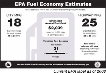
With this redesign we tried to take the approach of the average consumer, walking into a car dealership with the intention of buying a new car. We found that the existing informational sheet and the newly proposed one both had confusing hierarchy, and didn't focus exactly on what we would want to know as consumers. The purpose of these pages are to inform the consumer, not to confuse them. The question that we came up with that sums up our entire thought on the redesign is, "Well, how efficient is this car?"
To begin answering that question, we broke the hierarchy of the proposed and current EPA information sheet into 4 sections:
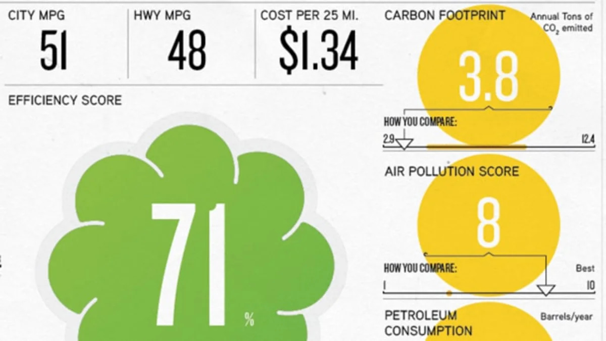
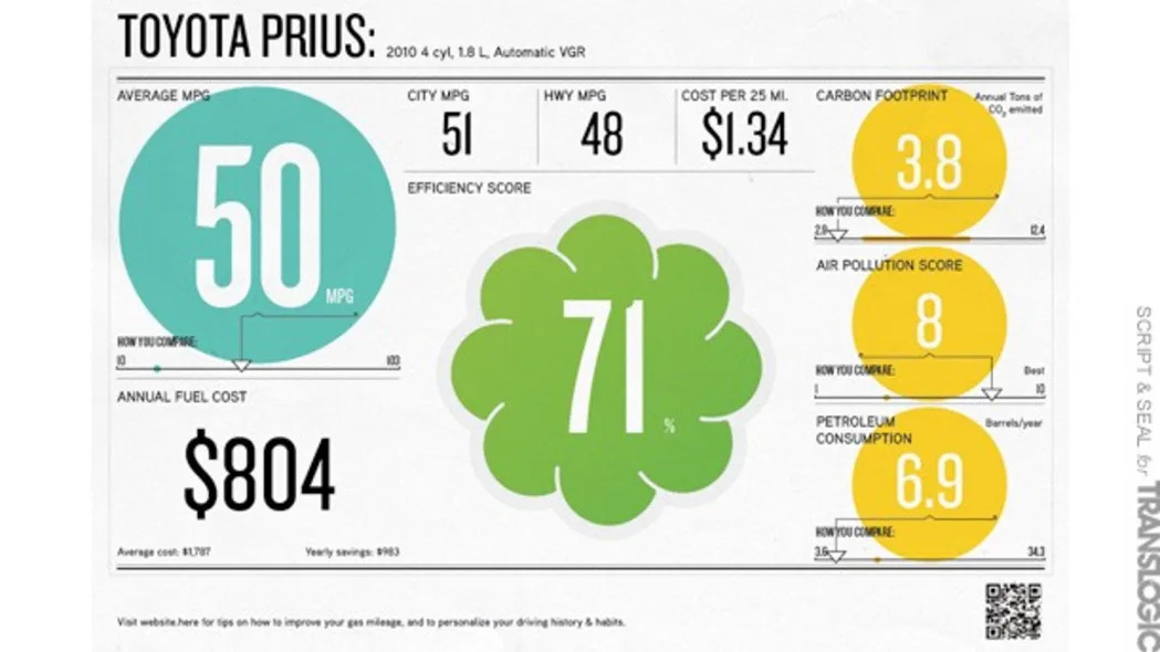
- MPG & annual fuel costs
- Overall rating, based on each factor
- Environmental costs
- Breakdown of MPG information
We came up with a rating system which is based upon the idea that each car in production today would receive a score between 0 - 100%. Each section of the informational sheet (Average MPG, Annual Cost, Cost per 25 miles, Carbon Footprint score, Air Pollution score & Petroleum Consumption score) would be reduced down into a percentage of how that car scores based on all other cars currently available on the US market. This way the consumer can understand where his/her car exists on this index rating system.
 It is a very simple mathematical equation but assuming the average consumer would not want to spend large amounts of time figuring this information out for themselves, providing them with one extremely simple, specific, overall score would be a vast improvement on how the system works currently. In our proposal, we use averages to find the rating for each car, but if this were to pass through, we would hope that a more scientific approach could be used to find a fair and legitimate number system.
After devising a plan for how to simplify the data, we wanted to focus once again on the buying process and ease of use. To piggyback on the number system, we wanted to add color to make the information pop off of the page and at the customer. Simply, the color corresponds to specific ranges of overall numbers: purple for a score of 0-33%, blue for a score of 34-66% and green for a score of 67-100%.
Since the average MPG is a very important piece of information to most consumers, we've coded it in a light modern teal color to draw attention to its location. On the right hand side of the page, a golden yellow is used to draw attention to the environmental costs for this particular vehicle. We know this bit of information isn't as important to some people but it is definitely an important message to bring attention to. Also, we really liked how the proposed version has a scannable barcode that allows the buyer to interact with the data, and we wanted to expand upon this to include a website so that people extremely interested in the subject can get more information and relate the figures to their own life.
Lastly, we felt that the informational page needed a unique symbol that would make it easily recognized as an authority. We came up with the idea of a cloud/flower shape in which to show the overall score for the cars. What makes this symbol even more unique is the fact that it is a foil sticker which can be peeled off and placed on a window of the car after it has been purchased. As part of an incentive for drivers to choose higher rated (and thus higher efficiency) cars, the EPA can work with local governments and organizations to provide Green (67%+ rating) sticker holders with incentives, such as lowered toll fare in busy metropolitan areas, HOV access during rush hour (much like the Clean Pass currently in use in New York and California), fuel rebates, etc.
We hope that this new version of the comparison chart makes the car buying process as painless and simple as possible.
Check out the rest of Translogic's Reimagining the Fuel Economy Label series:


Sign in to post
Please sign in to leave a comment.
Continue