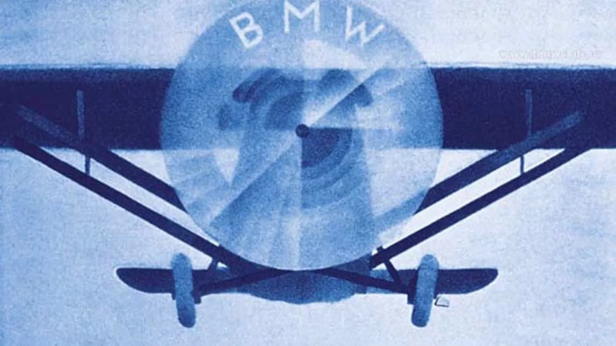
It turns out that not even BMW's spokespeople know that its Roundel emblem wasn't inspired by a spinning propeller. It's a common misconception, one that's finally been cleared up by BMW spokesman Tom Plucinsky, who explained that the company used to think its recognizable logo was tied to its aeronautical history. Plucinsky's colleague Dave Buchko had initially told the The New York Times that the logo was intended as a stylized image of a spinning propeller before being corrected by Anne Schmidt-Possiwal of the BMW Museum in Munich. To his credit, Buchko did correct the error himself once the real story came to light.
So what's the real origin? It turns out the blue-and-white logo was used in a 1929 ad that placed roundels in the rotating propellers of an airplane. It's easy to see where the confusion came from. The blue and white quadrants at the heart of the logo are actually intended to signify the state colors of Bavaria, and this isn't the first time the logo's origin has been examined in detail – historians have traced the logo's evolution from the Rapp Motorenwerke all the way through today.
[Source: The New York Times | Photo: BMWClub.ro]


Sign in to post
Please sign in to leave a comment.
Continue