American license plates are pretty darn interesting when you consider the drab white and yellow rectangles found in Europe. For something that's on a car for a purely practical purpose, they're surprisingly artistic. Well, some of them at least.
So here is a definitive ranking of all 50 United States license plates. Now, for the record, the Northwest Territories have unquestionably the best license plate in North America, but 50 is already way too many things to create a list about, and I had to draw the line somewhere. So no D.C. or territories, either.
Now some housekeeping. These rankings were chosen by a blue-ribbon commission consisting of myself. The criteria I considered included whether it enhances or worsens a car's aesthetics; is it symbolic of the state; is it distinctive enough to ID without reading the state name; is it stamped or printed/flat; and does it have a slogan, nickname or website (the latter is a bad thing and stupid — am I supposed to call it up while driving???).
I also only considered "standard" plates, or those that the DMV will give you by default. So no no-cost-option plates. In instances where there are multiple standard plates, I just picked the one I liked best. So on we go. And yes, I'm totally biased against the state you live in.
Tier 1: The colorful classics
1. Colorado
Every other state in the country wishes it could've come up with a unique, colorful and iconic license plate design 60 years ago and pretty much just moved on with their lives thereafter. Oh sure, the mountains have oscillated between white and green, the shade of green has been tweaked, and the mountains were given some detailing, but this is pretty much the same plate as always. There's only one state this could possibly be from, due to its familiarity/longevity, distinctive color scheme and that everyone knows Colorado is filled with mountains. I also like that the numbers are stamped and that there are only six of them.

2. New Mexico
Hmm, you don't like teal? Sorry, I love it, but more important, "turquoise" is truly indicative of New Mexico. The overpasses in Albuquerque are this color, for Pete's sake. The design itself, which actually got better when adapted from its original centennial design, is clean and classic, yet also distinctive. You have the state nickname of "Land of Enchantment" in a neatly sized and placed font that doesn't conflict with the equally classy "New Mexico USA" below. The state's "Zia" symbol, which has been on its plates for almost ever, makes its boldest statement yet. The use of yellow is also an obvious nod to the other official color of New Mexico, which has been on its license plates since the early 1960s. And still is, actually. The DMV lists both the teal plate and the yellow plate as "standard" plates (as opposed to no-cost options or pay-for options as other states have). I chose the better of the two here, but even the yellow one would've been up here near the top.
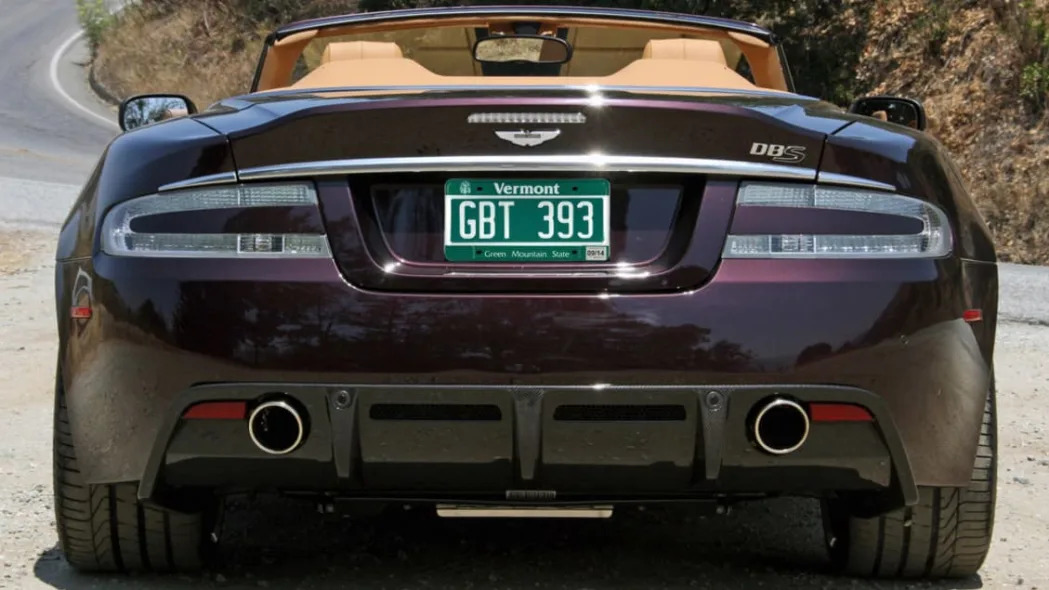
3. Vermont
OK, so this is pretty much the same color as Colorado's, but I don't exactly see that as a bad thing considering the color is great and that it doesn't appear in any other standard license plate. Besides the color, Vermont has the weird rectangle around the stamped registry numbers, clean and appropriate fonts for "Vermont" and "Green Mountain State," and a little tree in the upper right hand corner because it's Vermont. There are only three things that say "Vermont" more to me than this license plate: Bernie, Ben and Jerry.

4. Hawaii
True, you're not going to see this one very often here on the mainland, so the thing has an inherent mystique. Still, even if you'd never seen one of these before, you'd instantly know that it's from Hawaii. What other state would put a rainbow on its license plate ... and do so for 30 years? And despite having, well, a rainbow of colors on it, the plate still manages to be clean and legible. Sure, it may not complement every car color as well as some of the other designs below, but dude, it's the Hawaiian license. It's cool.
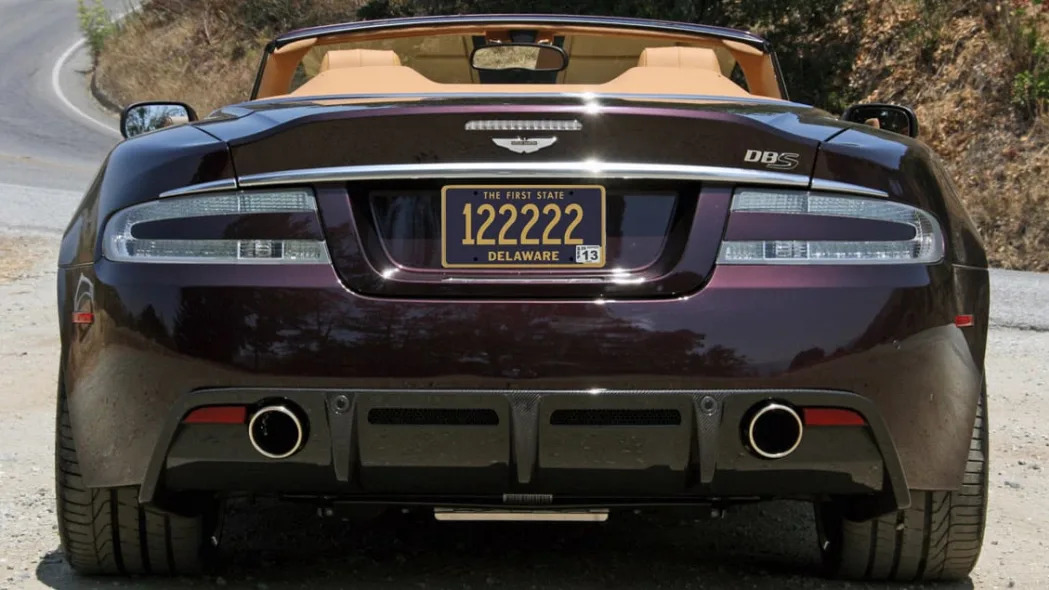
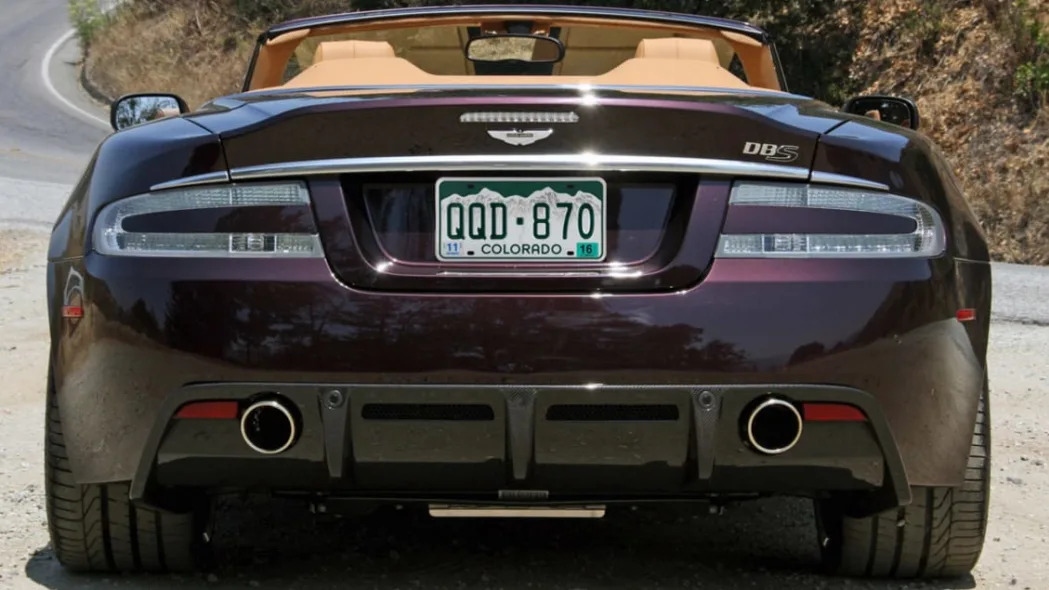
5. Delaware
This plate is like an NBA team in the 1990s that didn't change its color scheme and make its logo a cartoon. Sure, they looked old-fashioned back then, but now that fashion has come back to classic, they're quite happy they stayed the course. So be the Delaware license plate. Sadly, it's flat printed and looks a bit cheap, but it's also been that way for decades. Consistency! The classy dark blue color framed in gold with matching writing is timeless enough to make up for it.
Tier 2: Symbolic, distinctive and tidy

6. Rhode Island
Like Hawaii, this plate is a distinctive classic that relies upon a unique background design rather than a bold color. Rhode Island is the Ocean State, therefore it has a big wave. And an anchor. You also gotta love that so few people live in Rhode Island, they don't even have to worry about stuffing six digits onto the thing, let alone seven. Indeed, you can have only one digit … and people pay big money for them.
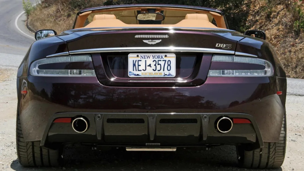
7. New York
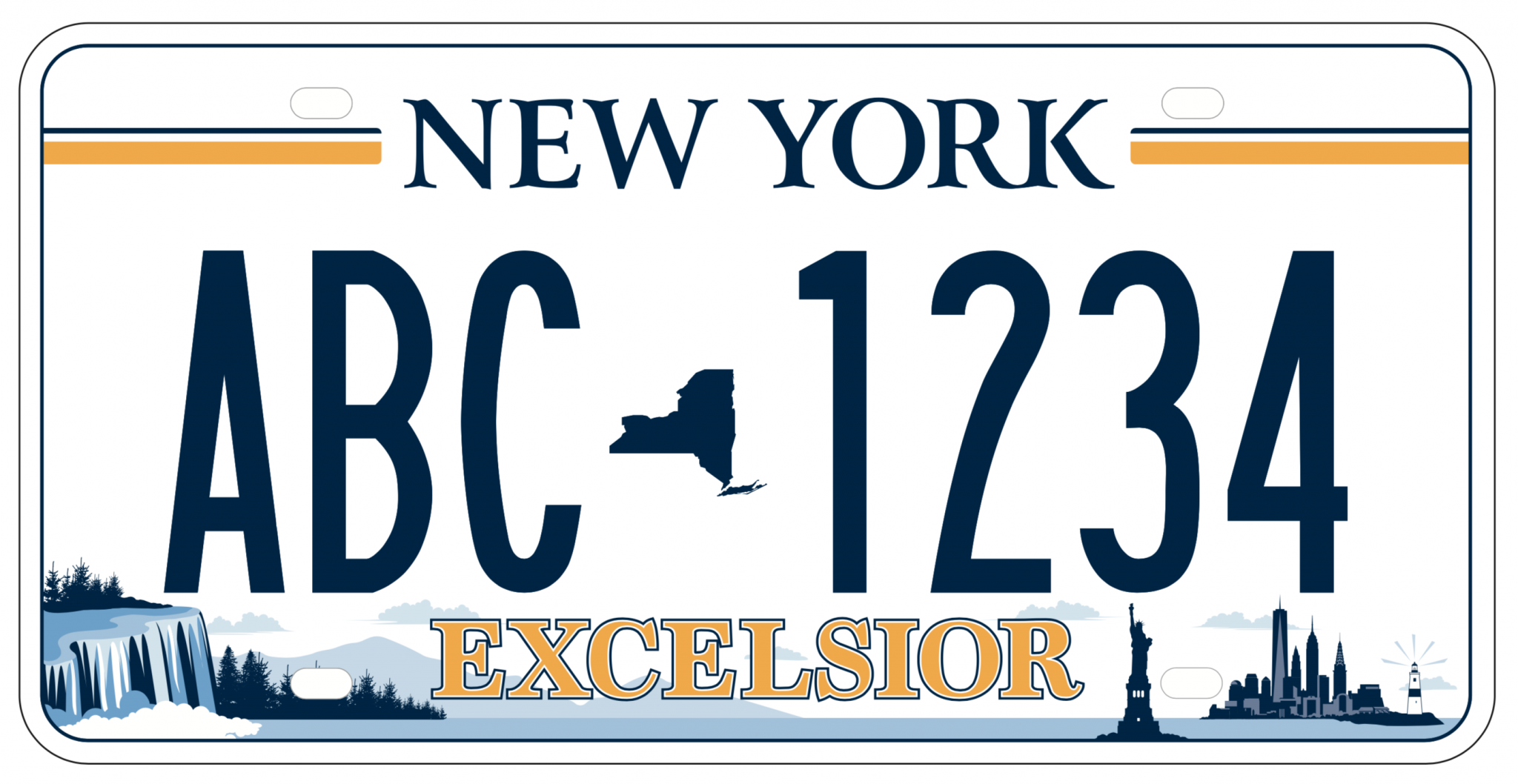
This is New York's just-released plate and it's just terrific. Somehow, they managed to visually represent this diverse state from Niagara Falls and the forested mountains of Upstate New York to the skyline of Manhattan and the coast of Long Island. There's also a Statue of Liberty, long a N.Y. plate staple, plus a map of the state, the state's name, the bold slogan of EXCELSIOR and seven digits. This should be a busy mess, yet it's clean, classy and would look great on basically any car. The old plate looked like it should be exclusive to cabs or government agencies. This one is an Aaron Judge 470-foot blast. It's even stamped rather than printed. Never change it.

8. Nevada
This is a rare modern plate that manages to be colorful without being busy, cartoonish or clashy with the car. As baseball teams of the 1970s and '80s will attest, this shade of powder blue pairs well with most colors. It's looked great on every car I've seen wearing it. The design works, too. There are multi-color mountains, but they're artistically rendered with a geometric pattern instead of a literal depiction. The state map is also used as a registry divider (six digits!) and the state name appropriately features a cowboy-ish font. I honestly don't know how true the slogan of "Home Means Nevada" rings to those who live there, but it's a creative change of pace from the long-used "The Silver State."

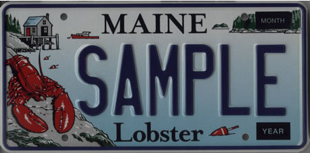
9. Maine
Maine could have this as its standard plate. We would laugh and I'd then direct it way down this list to the "Toon Town" tier. Instead, it has this classy design. Dubbed "The Chickadee Plate," it's been around since the turn of the century with its bird (I assume a chickadee) on a coniferous branch that distinctively offsets the registry. How indicative is a chickadee to Maine? I have no idea, but I'm not from there. The silly lobster is for outsiders like me, this is for Mainers. Maineists? I really should learn more about Maine. Anyway, the plate has an atypical shade of green for the pine needles and diffused forest scape, the black trim and letters really pop, and "Vacationland" is just the right shade and size.
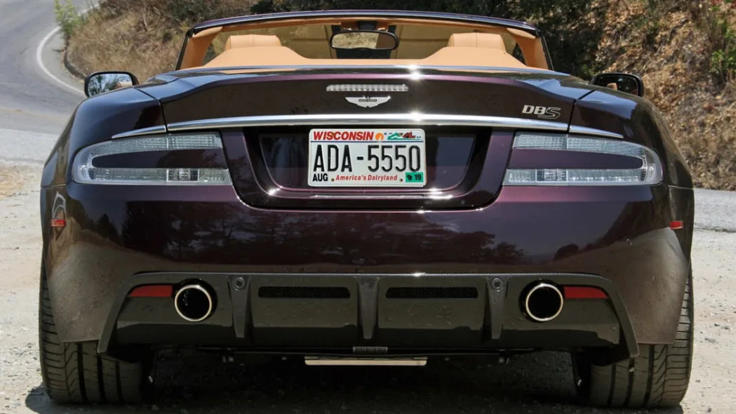
10. Wisconsin
This plate is pretty dated due to its italicized fonts that have been out of fashion for 20 years (And yeah, I'm grading on fonts here. Rest assured, it'll get worse than this). There's also a lot of colors going on that can make it look a bit cheap. Still, this is unmistakably Wisconsin … it's looked like this since 1986, and there's nothing else like it (especially the combination of flush-left state name and the consistent visual interpretation of the state in the upper right). I also like that the blue line doubles as the water for the sailboat. It's a great piece of design. A classic can be born in the '80s, too.
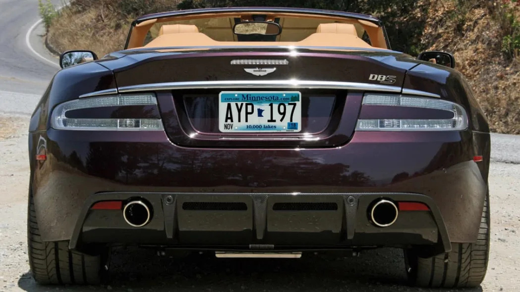
11. Minnesota
This is another great piece of design that goes back decades. With its unique shade of blue, centered state map, "10,000 Lakes" slogan and lake imagery above, "Minnesota" doesn't even need to be written on the thing to indicate where that car is from. Which is why it's a shame that the state cluttered it up, first with "Explore" in the upper left and then with the first appearance on this list of an infernal website. That the plate integrates the ".com" after "Minnesota" at least rescues the plate a bit, but the fact remains that it busies an original great design. This blue color, while handsome in a vacuum, can also clash a bit with certain car colors.
Tier 3: A little too classic
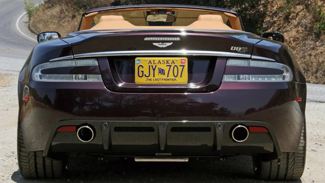
12. Alaska
When this list was first published, Alaska was No. 6 and was grouped in the top Colorful Classics category. After great reconsideration, however, the blue-ribbon commission consisting of myself decided that just being a simple, classic design shouldn't necessarily put a state up at the top. As such Alaska and the next two entries have been bumped down into this new category. So, why does Alaska get bumped? Well, as I originally pointed out, this shade of yellow doesn't pair well with everything – reds in particular – and is awfully indicative of a taxi. Despite all of the above, though, it's still a tidy design that updates a classic used from 1981 to 1997. Previous plates were broadly similar in concept with the exception of this one-off gem and the design from 1976 to 1981 that itself is enjoying a comeback as a no-cost option plate. So although Alaska isn't as high on the list as it was before, it's still deserving of a lofty spot.
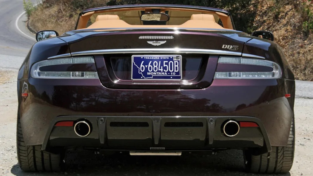
13. Montana
According to its DMV, Montana has five standard license plates you can pick up for the same fee. However, four of them are previous standard designs. The current, official standard one is this modern classic. It's a great color (as Michiganders could once attest), has clean fonts, and then the coolest bit, the state outline. Would it be better if the entire plate was that shape? You bet. Ultimately, I dropped this down from the other colorful classics because it tries to fit way too many digits into the map, which creates clutter and an awkward asymmetry. The whole plate also looks quite obviously printed.
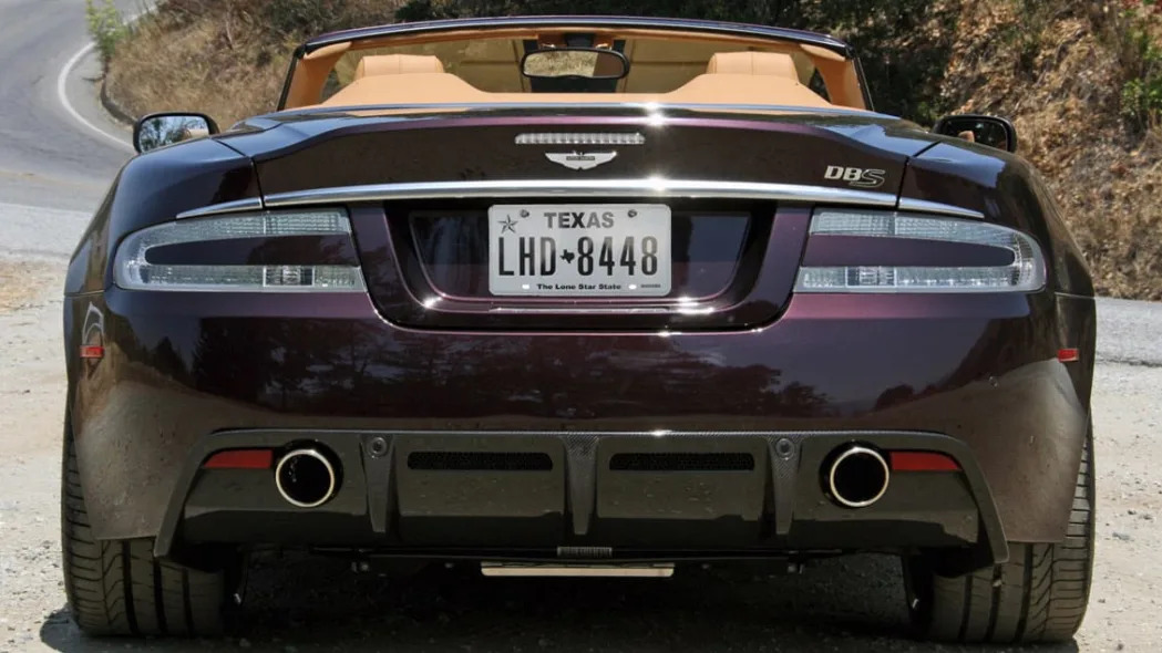
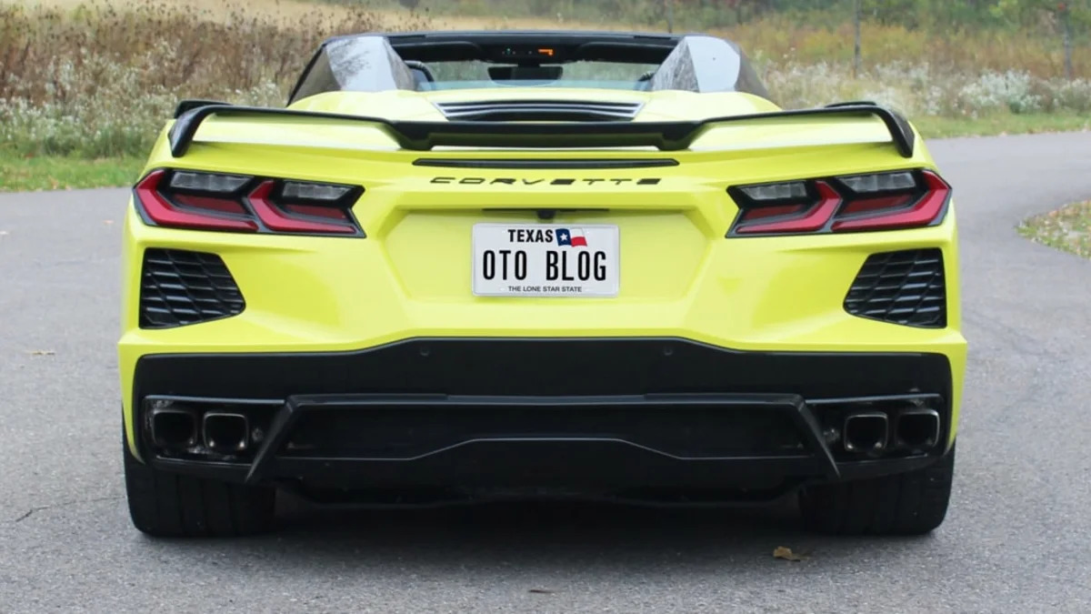
14. Texas
Of all the feedback I encountered after the original list order, Texas (No. 7) was the one that drew the most ire. Much as I originally thought, people think it's way too plain and that it looks like a paper temp plate. They're not wrong, which is why it finds itself bumped down into this new category. Nevertheless, this license plate still has most of the elements that make a great plate. History and consistency: Texas had black-and-white license plates for decades. Clean design with appropriate decorative elements: clearly read state name, a unique emblem (lone star), a map of the state as the registry number separator, and the state nickname. Uncluttered: Texas doesn't use registration stickers and managed to split the seven-digit registration number in two, which improves aesthetics and maintains legibility. Stamping this plate rather than printing it would make a huge difference, or even swapping the colors so that it's white on black as was done in the past. As it is, though, I'd still rather have this on my car than most others.
Tier 4: Vibrant, distinctive, symbolic, probably going to clash
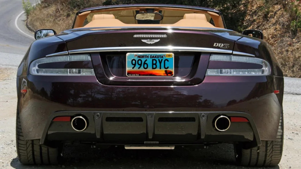
15. North Dakota
This is similar to Nevada's in general concept and I like it lot, however, the blue is darker (more likely to clash), the smear of orange depicting the Badlands is perhaps too bold and there's just a lot going on. Still, when evaluating it by itself away from a car, it's a tidy, striking design that seems appropriate for the place.
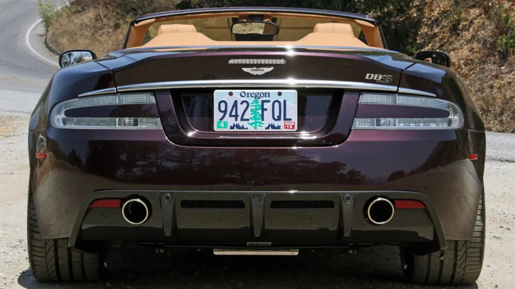
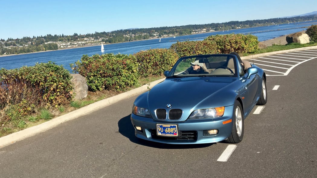
16. Oregon
This instantly recognizable plate checks off most of the boxes. It's stamped with six digits. There are mountains and forests that look like that in Oregon, and there's literally a tree that looks just like that out my back window. The "Oregon" font is unique as is the general color scheme, but that's ultimately a problem. Lilac is not a color that pairs well with much (besides the purple Aston Martin I ironically chose for this little exercise) and that tree draws too much attention to itself. A nice plate by itself, but once on a car, there's a reason I paid extra for Oregon's Delaware-like Pacific Wonderland plates.

17. Idaho
Again, a terrific design indicative of the state. Idaho is scenic and it is famous for potatoes. There are mountains and forests there. The plate is aesthetically pleasing, even with as many as seven digits. The problem, besides being quite obviously printed rather than stamped, is that two bold, darker colors and white draw too much attention to that design once placed on the back of a car. It should complement, not distract. At least this is a much better example than others (cough, Pennsylvania, cough).
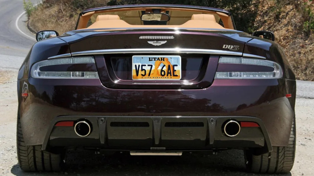
18. Utah
Arches National Park is in Utah, and there's definitely not other plate like this. Yes, the orange is an awful lot and the illustration veers a little into Toon Town territory, but at least it's not that busy. Six well-spaced registry digits, a four-letter state name and a good slogan of "Life Elevated" in a small font helps. This is actually one of two standard Utah plates, with the "Greatest Snow on Earth" plate being the other. I'm not sure where that would've ended up, but I like this one better.
Tier 5: What's up, ombre?

19. Connecticut
The gradual fade of one color into another is known as "ombre," and Connecticut made it a thing on license plates with its blue-into-white design. People must've dug it because both Kentucky and Missouri ripped it off. The original is still the best, partly because blue on top seems to look better than the reverse, and because the overall design is uncluttered with two key elements of state map and nickname.
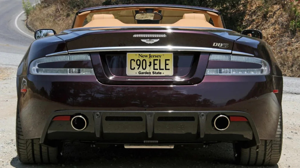
20. New Jersey
I think New Jersey's plate probably looks better on various cars than Connecticut's (it shows up on a lot of press cars), but then I needed to explain what ombre meant, and this example is less obvious. Anyway. This pale yellow is actually unique among plates, making it instantly recognizable. It also has the nickname and always-appreciated state map breaking up the six-digit registry. Solid plate.

21. Mississippi
The use of the state seal as a graphical element is lame, especially as one as generic as Mississippi's. Honestly, this was going to end up in the "Fine" category, but then I saw it on the purple Aston Martin up there. Turns out, the bold choice of gold pairs quite well with rich colors (plus black). Electric ones or white? Probably less so. The Mississippi font has also been used for ages, so points for consistency.

22. Louisiana
Thanks to the New Orleans basketball team and this license plate, I think we can all safely say we know there are pelicans in Louisiana. I can't say I really want one on the back of my car, though. Ultimately, this is a nice, uncluttered design, with a distinctive color scheme, a good slogan, and yep, a big old bird.
Tier 6: Distinctive and symbolic, but busy

23. North Carolina
With a few tweaks, this plate would probably rocket up the list to somewhere around Maine. First, the fonts are too brightly colored, easily clashing with the car itself. Second, the "North Carolina" is punctured by the plate holes, which could be corrected by making the font smaller or moving it up (see New Mexico). And third, "First in Flight" is also too big and yet can still be difficult to read because of the Wright Brothers doing their thing in the background. Ultimately, this plate is just a bit busy and could use a subtle update of the same generally solid design.
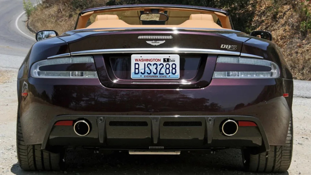
24. Washington
This plate could have easily been up around No. 12, except it was utterly ruined by shoehorning the seventh digit into the open space that proudly showed off the diffused depiction of Mount Rainier behind. Other states, like New York and Texas, managed to fit seven while maintaining the space and general aesthetics. Such a shame. That unique Rainier backdrop, flush-left state name in bold red, and the clean contrasting "Evergreen State" was originally a great design. Washington just mucked it up. Worse, from afar, it kinda just looks like a dirty California plate.
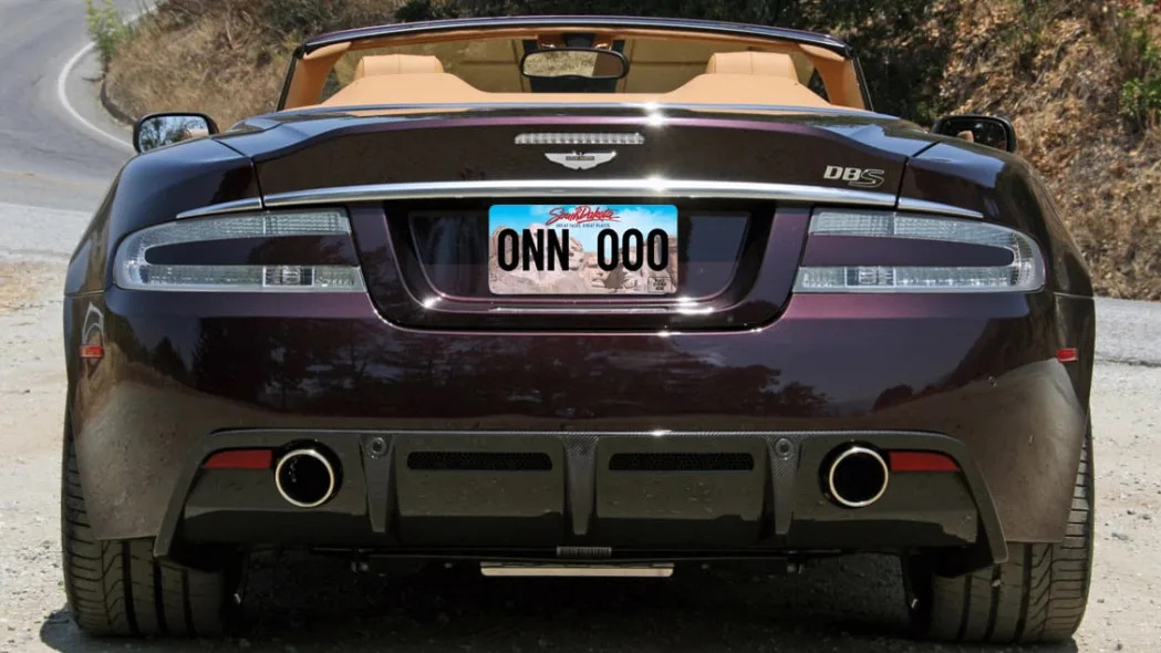
25. South Dakota
South Dakota has moved up in the world! Or rather, up this list for 2023, but only by two spots. This is basically the exact same basic design as before, but then South Dakota has had a depiction of Mount Rushmore on its license plate since 1952 (it was WAY ahead of its time here), so there was no chance they were changing things up. Points for continuity! Also, when one thinks of South Dakota, I'm pretty sure the only thing most people can recall is Mount Rushmore. Now, as for what changed and why it moves up the list. The depiction of Mount Rushmore is basically now just a photo rather than the ugly, drab beige that paired poorly with various car colors. This is ultimately the reason it moves up the list, but the use of the photo remains inherently busy and honestly, just doesn't seem right for a license plate. Another change is relocating the slogan from the plate's bottom to just under the state name in a smaller font. The slogan itself, "Great Faces. Great Places" is the same and has been used since 1990, so again, points for continuity!
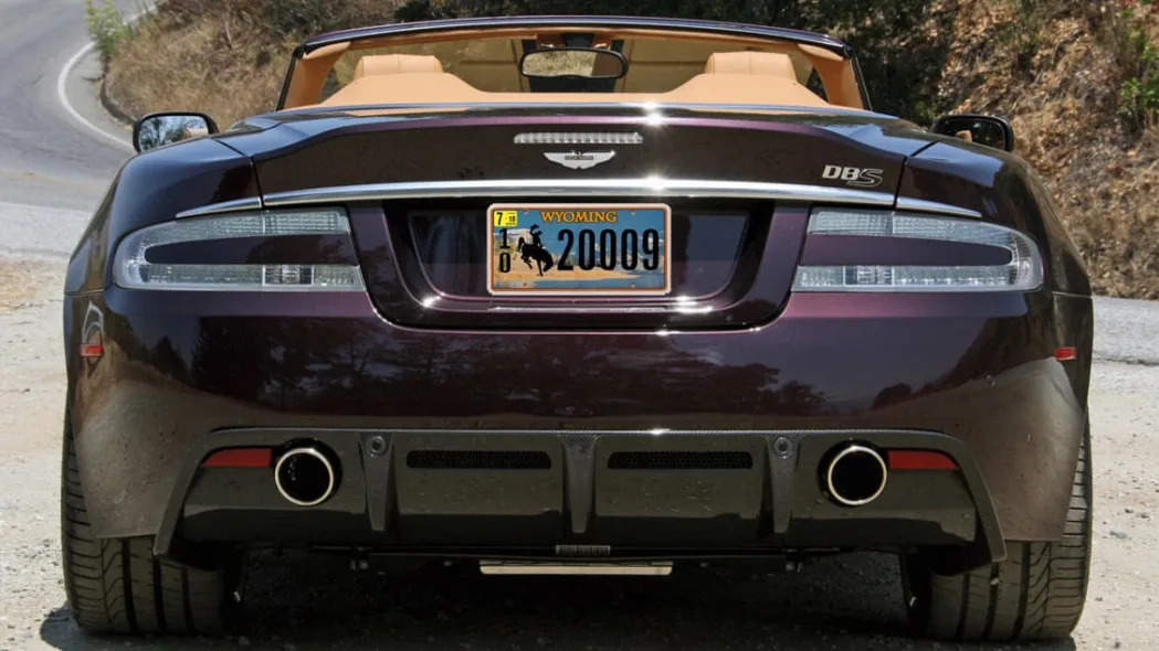
26. Wyoming
Wyoming has had that iconic Bucking Horse and Rider emblem on its license plates since 1936, which speaks to knowing a good thing when you have one. Until 1975, it pretty much just changed colors every year, then added a fence to the bottom and a very McDonalds/San Diego Padres color scheme throughout the late '70s and '80s. Since then, the state has taken full advantage of license plate printing technology with various photorealistic landscapes in the background. The latest one adds a rope border around an image of "the Green River Lakes and Squaretop Mountain." There's just a lot going on and it’s a tad cartoony. I've strongly debated putting it in the Toon Town category below, but then I ultimately decided it's just a better design than the others below and also is more of a photo-realistic landscape than a cartoon. Either way, time to go back to a classic, Wyoming, you used to do it better than anyone.
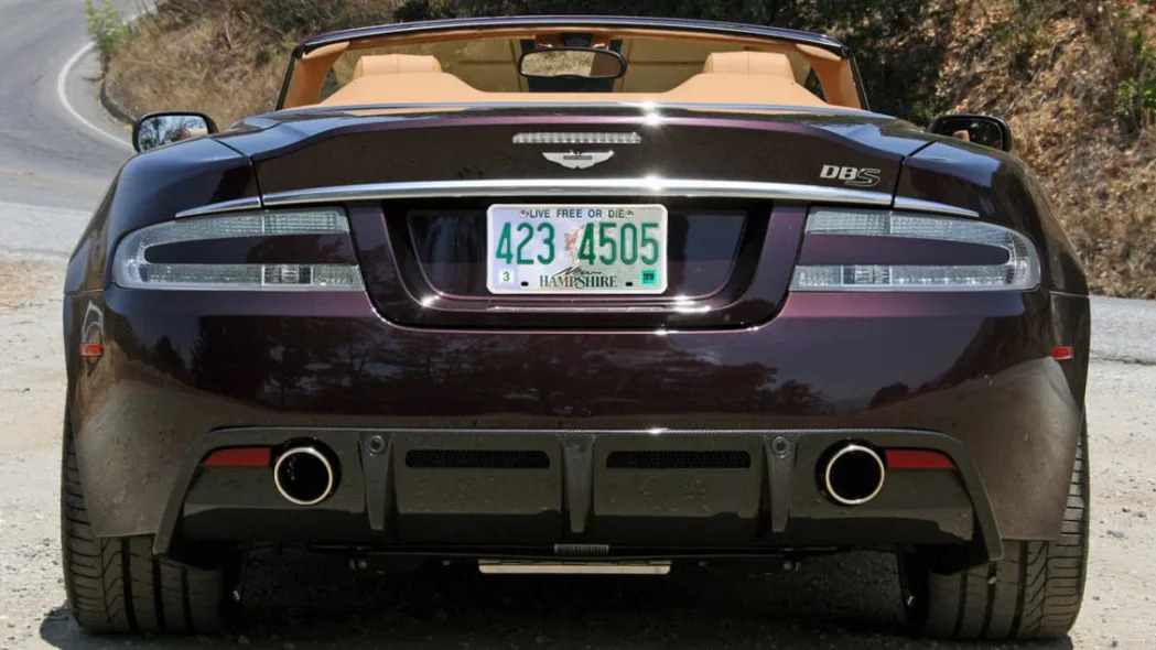
27. New Hampshire
I waffled a bit on this one, wondering if it was worthy of being in Tier 3, but nah, it's too busy. While that green color is Top 3 material when used as the background, it's difficult to read when used as the font. There's also both powder blue and pale green in the background, plus that Old Man of the Mountain that Granite Staters seem to love so much … and that collapsed all the way back in 2003. It's like Washington putting pre-1980 Mount St. Helens on its license plate.
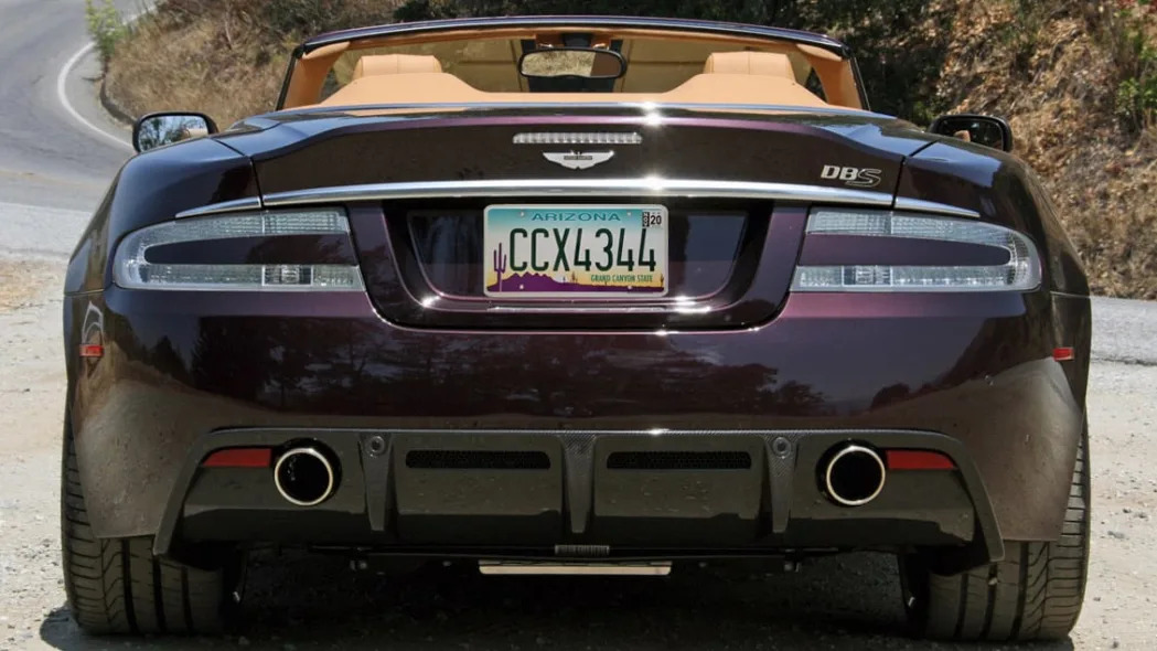
28. Arizona
Here's another for the "you mucked it up" sub tier. When introduced more the 20 years ago, this plate was stamped and had six digits. It looked pretty good and was certainly a unique design obviously indicative of Arizona. There are eroded mountains and cacti aplenty there. Colors of teal, purple and orangey yellow are also as Arizona as it got (if you go by Arizona sports teams of the era, minus ones that originated in St. Louis). Unfortunately, in 2008, the plate became screen printed and not only was a seventh registry digit added, but the series of numbers and letters became oddly right-justified to leave room for the big cactus and the font was changed from the usual, attractive rounded font to a very severe and fake-looking one. So although it's still a unique design and instantly recognizable as being from Arizona, it's now ugly.

29. Florida
Oh Florida, you'd couldn't just leave excellence alone. The basis of this plate is the classic design Florida had from 1979 to 1997 with very Floridian shades of green and orange for the letters and map of Florida. Colorful, instantly recognizable, Top-10 stuff. But then they spruced up the Florida font (I'm OK with that) and added a big orange on top of the map (now you're losing me). Then a second orange, a flower and "MyFlorida.Com" to the top so that people will always know where to find "The Official Page for Sunshine State Government." Cause there's not a Google or anything. Still, could be worse …
30. Tennessee
This plate is instantly recognizable as being from the Volunteer State, mostly due to the unique color applied to the mountain scape. It even has six registry digits separated by the state map and a unique font for "Tennessee." Unfortunately, they couldn't stop there. There's "The Volunteer State" in tiny font plopped on top of "Tennessee" because its usual spot at the bottom is taken up by the gigantic county name. There are not only month and year stickers in the upper corners, but spots in the bottom corners for a class code, model year and "wheel tax decal." It also implores you to visit the Tennessee tourism board website AND(!) there's the no-cost option to add "In God We Trust" surrounding the middle Tennessee map. Couldn't find a place for a bust of Andrew Jackson and a kitchen sink?
Tier 7: Fine
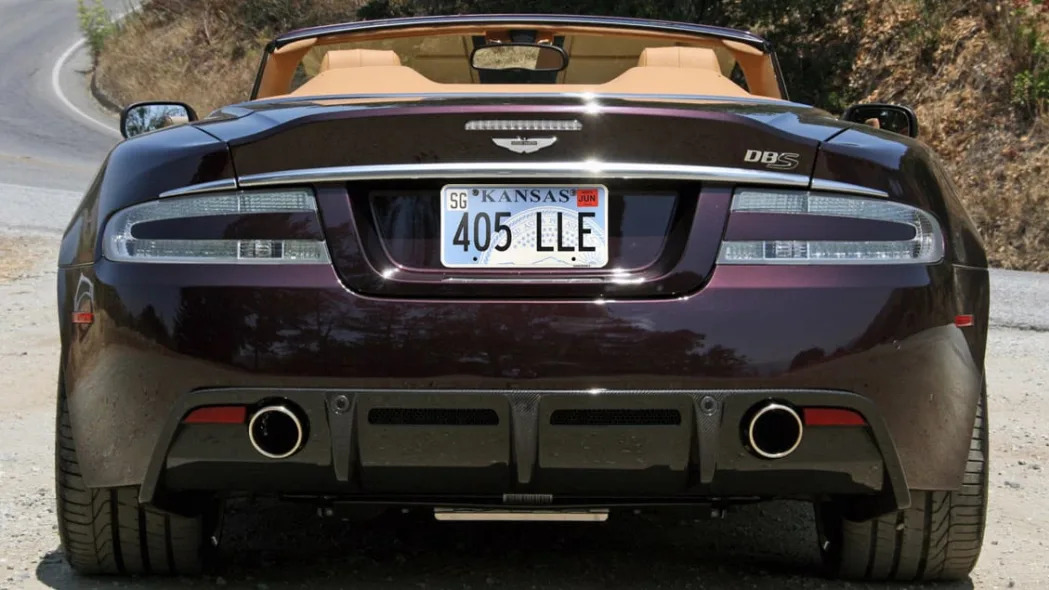
30. Kansas
The color of this is nice. As we learned from Nevada, powder blue pairs well with just about anything. It's also an uncluttered design with only six digits and has the unique graphical element of zooming in on the state seal. But that's part of my problem with this. The choice of state seal is inherently an uninspired one (every state has one!), but worse, it's the bottom bit of the Kansas seal that's the distinctive bit … and that's the part that's been chopped off! Not bad, but ultimately anonymous.
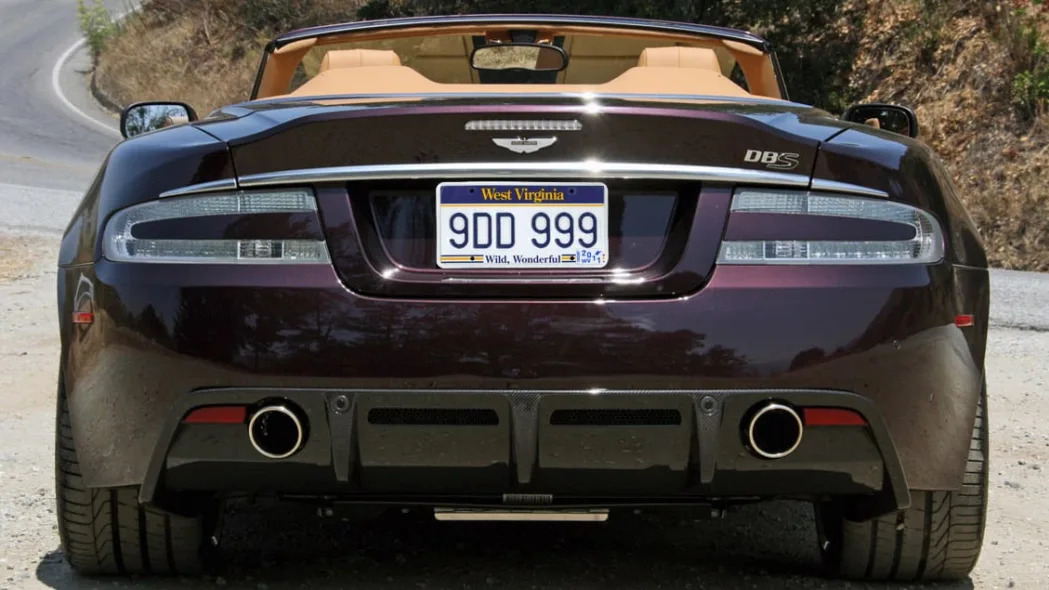
31. West Virginia
This looks like it was inspired by a varsity jacket. The fonts, the stripes, the numbers … they're very Friday Night Lights. West Virginia has been rocking this since 1995, with the only interruption being the inclusion of a website from 2000 to 2006. It saved itself a lot of spots on this list thanks to that correction.
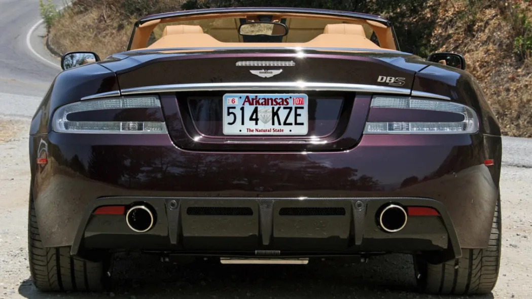
32. Arkansas
This could use an update. Specifically, the "Arkansas" font is way too huge and the blue ombre is too Connecticut. But it's still better than those in the "Bad Ombre" tier and just generally fine, so here it is. I like the font itself, and the big-ol' honkin diamond makes the plate instantly recognizable as being from The Natural State. Which sounds like something women with hairy armpits espouse.
Tier 8: Toon Town
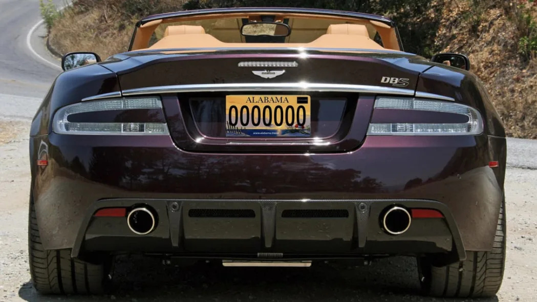
33. Alabama
Congratulations Alabama, you've moved up the list! By only one spot and you're still firmly entrenched in Toon Town, but improvement's still improvement. This new plate, which has started rolling out for 2022, features a generic beach landscape rather than the old, generic mountain-and-lake landscape. As before, the image could be from any number of states. It also seems weird that Alabama would choose to so prominently feature the tiny sliver of itself that touches the Gulf of Mexico, but then I'm not from there, so what do I know? What I do know is that this is a more attractive and complementary color scheme than the old one. It should pair quite nicely with most colors without drawing too much attention to itself. It's a good-looking plate and, honestly, I could probably be talked into moving it up to maybe the 26 range below Wyoming. The hang-ups? The generic nature of the image for one, and another, they added a website. Tsk tsk.

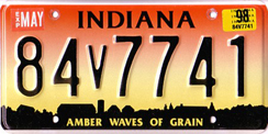
34. Indiana
Indiana gets new plates every five years and since 1993 has mostly oscillated between classic designs and colorful illustration designs. When I moved to Indianapolis in 1996, we had this tequila sunrise "Amber Waves of Grain" plate I recall that Hoosiers particularly despised. By 1998, it adopted the truly classic "Crossroads of America" that they never should've gone away from. My first car wore it well (and my current car could too, since Indy allows you to rock period-correct plates). Anyway, Indiana has made its way back to Toon Town with the current design. It could be and has been worse, but there's way too many colors going on and it looks childish. It belongs on a Cozy Coupe, not a real car.
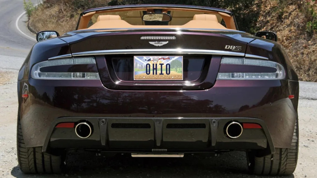
35. Ohio
Wait a minute, Ohio improved its standing on the list with this new plate? The same new plate that led to great embarrassment and 35,000 recycled license plates after it was pointed out that the prominently featured Wright Brothers plane was originally pointed in the wrong direction? Yep, I guess so. It's certainly a more successful effort than the ugly, bizarre previous design (formerly No. 40) that featured a background of nicknames and slogans. Actually, it just seems like more of an effort, period. That said, this quite clearly belongs in Toon Town with its cornucopia of colors, cartoony imagery and the kitchen sink approach to making sure various parts of the state are represented. Oh, and the Wright Brothers.
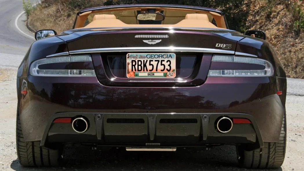
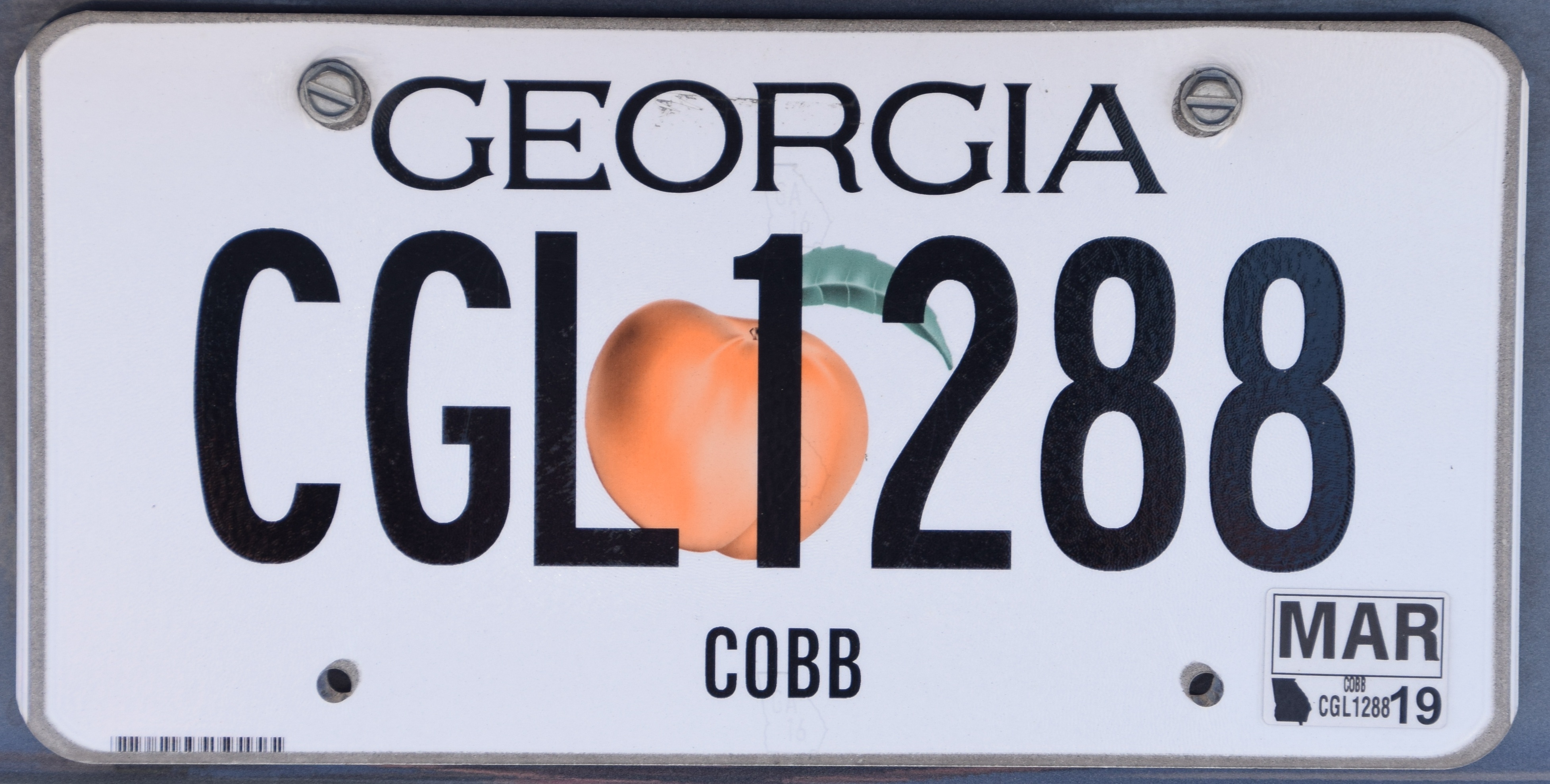
36. Georgia
This thing is hilarious. I came up with this tier's name, Toon Town, because this plate literally reminded me of "Who Framed Roger Rabbit?" when Eddie Valiant drives into Toon Town for the first time. Before doing research for this list, I just assumed this was an optional plate that "Song of the South" aficionados chose for their cars. Nope! Toon Town up there is the standard one. This bland, but perfectly acceptable peach of a plate is actually the no-cost option. Considering I see far more cars with that on it might tell the Georgia DMV something.
Tier 9: Fail
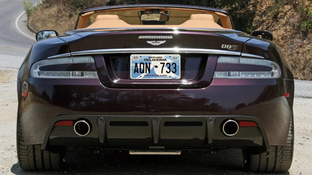
37. Oklahoma
What is that thing? I originally thought this was a flower and therefore a special EV or hybrid license plate as some states have. Then I saw it on a Challenger, so nope. Apparently, this design confused plenty of Oklahomans, too, who either didn't recognize it was a bird or didn't know what type of bird it is. Apparently it's a scissor-tailed flycatcher. Alrighty then. You gotta give them credit for trying something, but this plate is ultimately too arty, conceptual and busy. Also, website.
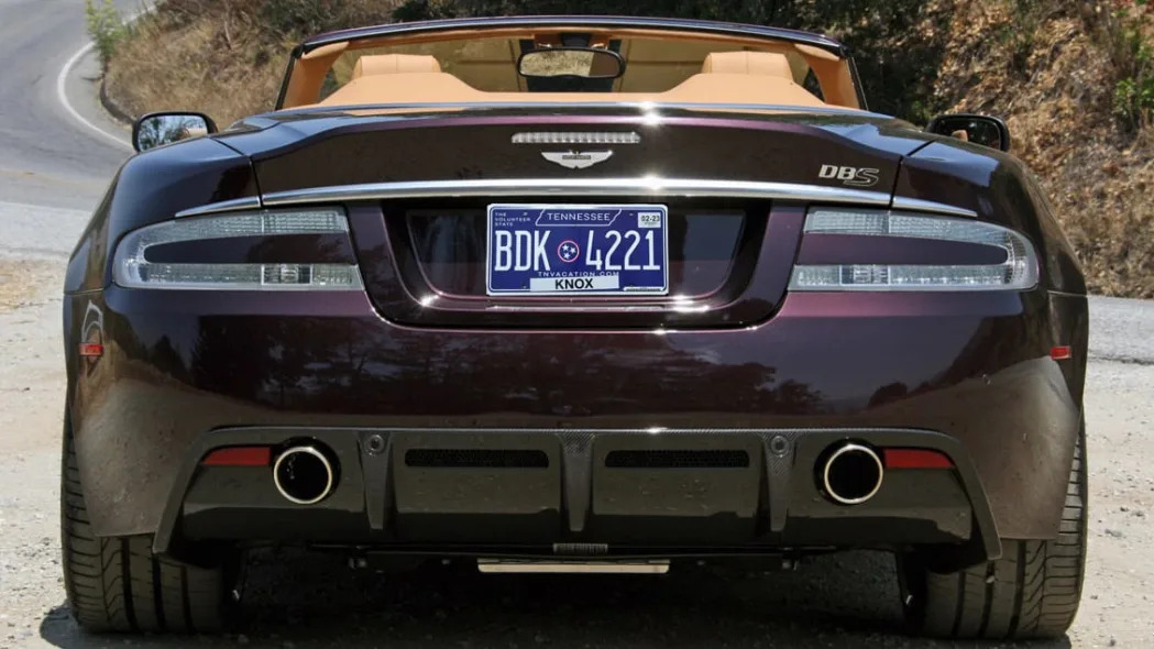
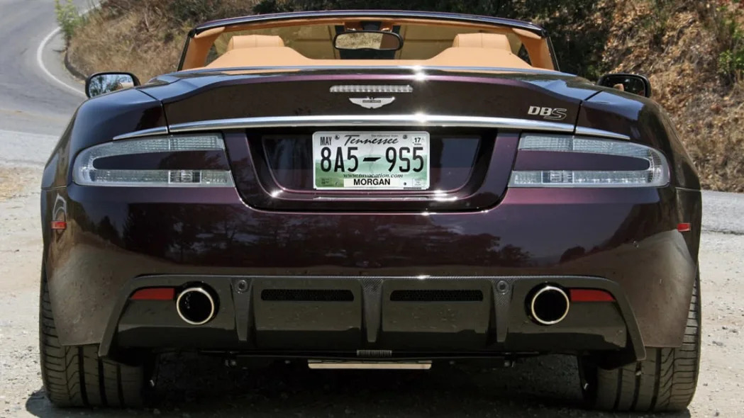
38. Tennessee
Tennessee got a new license plate in 2022! Unfortunately, our blue-ribbon commission has determined that it's a worse design. Or rather, it suffers even more from the exact same problem that doomed its predecessor: it's incredibly busy. This time, Tennessee was clearly trying to go for a more classic vibe with a clean dark blue plate and crisp white lettering. Great start. The letters are nicely separated by the state's unique three-star emblem. Alright, so far so good. And hey, there's a "The Volunteer State" in the upper left hand corner to satisfy the slogan or nickname requirement. Had Tennessee stopped there, it would've skyrocketed up the list. Alas, it did not. TENNESSEE is outlined in a state map. The dreaded TNVACATION.COM website is on there. The state insists on a giant white county sticker at the bottom in addition to the registration sticker in the top right. AND! Should you be so inclined, "In God We Trust" can encircle the three-star circle. Apparently, they couldn't find a place for a bust of Andrew Jackson and a kitchen sink. So, the end result is ultimately less busy than the old one because it's a plain blue background, but the old plate's green mountain scape was at least unique and instantly identifiable. This could easily be Montana at a glance ... until you look closer and spot all the extra crap tacked onto the thing.
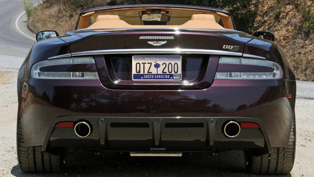
39. South Carolina
This plate looks really printed and really fake. The cursive font for the slogan "While I Breathe, I Hope" belongs in a high school yearbook, and the plate in general is just really plain apart from the palmetto tree that's been on S.C. plates for ages. The last design at least inserted some orange into this same general design (double ombre!) and there was an undulating landscape at the bottom instead of just a plain bar. This plate was originally higher on this list at the bottom of the Fine category, but after some thought, it's just bad. Try again.

40. Iowa
This plate looks cheap. And fake. And whipped up in Illustrator in an hour. And good grief, look at all those colors. Light blue, medium blue, olive green, pea soup yellow, black, white and whatever the registration month sticker is. The fonts could also not possibly be more rudimentary. But hey, at least it's unique. No other state can quite claim this flavor of ugly.
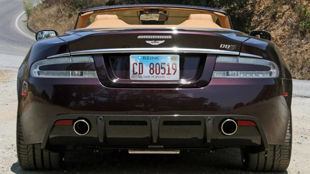
41. Illinois
If you look up close to this plate, you'll see that it depicts various key elements of the state: the Chicago skyline, farm lands, the state capitol in Springfield, and as the Land of Lincoln, half of Abe. Except you really need to zoom in to see all that, and from afar on a car, it just looks like a weird, blurry ombre-ish thing with red letters.
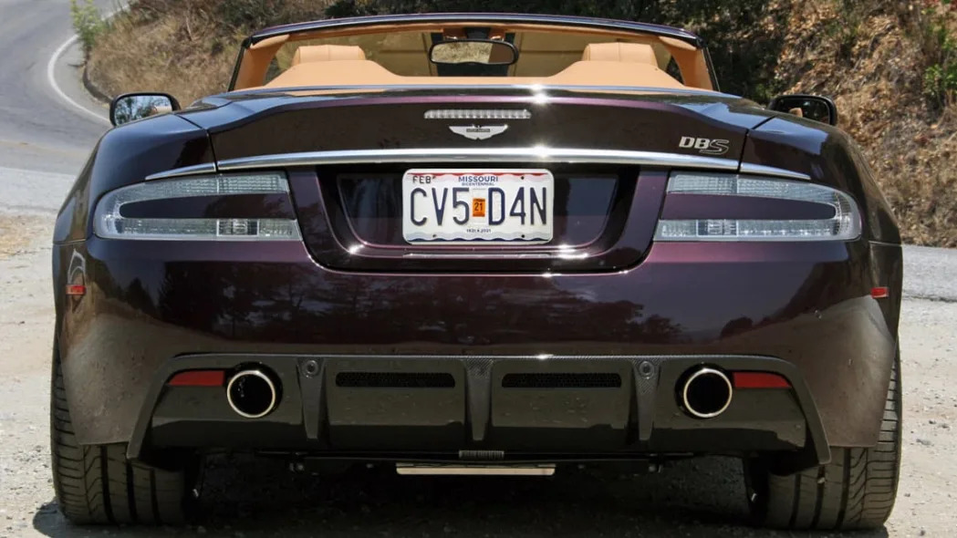
42. Missouri
Although Missouri's bicentennial happens to be this year, this "Bicentennial 1821-2021" plate has actually been around since 2018. This seems so phoned in with its red-white-and-blue color scheme and squiggles at the top and bottom. Why the squiggles? According to the state government entity in change of license plates, "Waves in the bands of color represent a river. Rivers are an important symbol for Missouri, as waterways figured prominently in the state’s historic role as a gateway for American exploration and transportation." That's awfully conceptual for a license plate, and not a particularly clever concept, either. Worse, the end result isn't exactly attractive. On the other hand, the old Missouri plate was just a ripoff of Kentucky.
Tier 10: Bad ombre
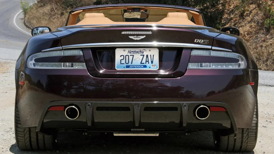
43. Kentucky
This too is an ombre design, but it's way too generic and dated to go so high up on the list with the others. So it gets its own … plus Maryland. Though I like the "Kentucky" font with the galloping horse and "Unbridled Spirit" slogan, you can literally find this collective emblem on all sorts of stuff. They therefore just took a generic plate, pasted a ubiquitous logo onto it and called it a day.

44. Maryland
Well, this is something different: Maryland's admittedly unique state flag along the bottom ombred into white above. Trouble is, this is really easy to do in Photoshop. Like, "Hey Gary, want to whip up a new license plate? You've got 15 minutes" easy. The end result looks fake, busy and ugly. Hat trick!
Tier 11: You're just not trying
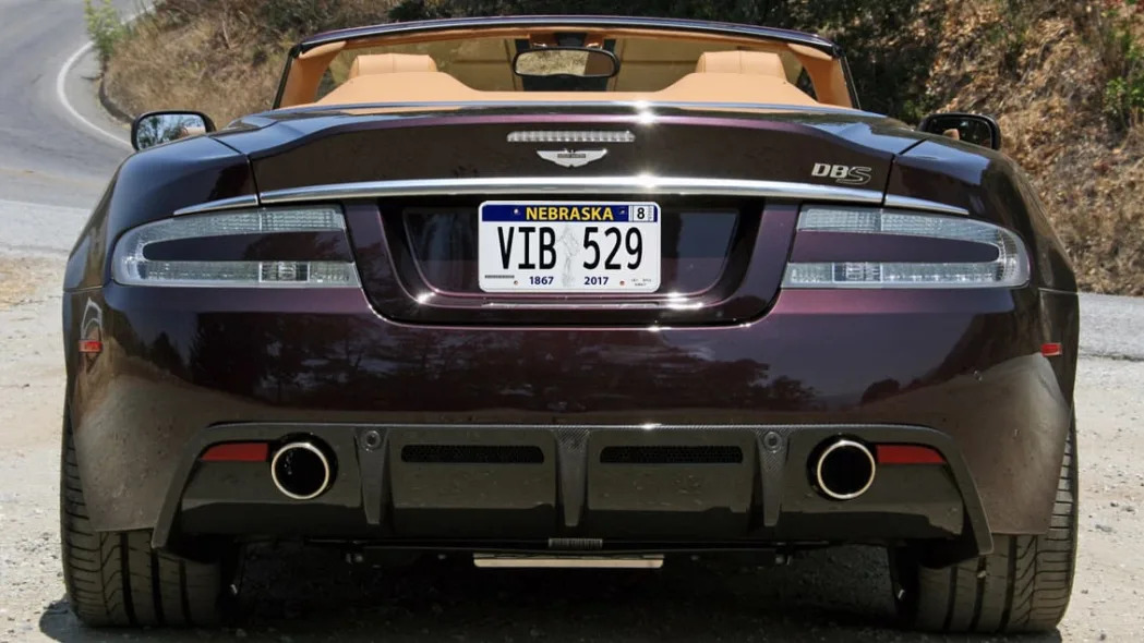
45. Nebraska
Is that an 18th century dandy with a purse standing on a Reese's peanut butter cup? Cause that's what it looks like, at least if you get up close to it. From afar, as it is up there on the Aston, it's just a blur. Either way, it is actually a statue called "The Sower" that's mounted atop the Nebraska state capitol. Really, though, that's the most indicative thing you can depict from your state? On a celebratory plate, no less? And you're basically going to go with a toned down West Virginia design? Apparently, it's not too popular in Nebraska, either.

46. Virginia
Basically, the state added the existing "Virginia is for Lovers" logo and a website to its existing, boring, could-be-anywhere plate. They don't really seem to care, so neither will I. Moving on.

47. Massachusetts
This plate's been around since 1993, as if that isn't abundantly clear by the very-1993 italicized fonts. Speaking of fonts, Massachusetts' red registry numbers have always been oddly too rounded and their placement often looks unaligned, as if the stamp's digits weren't properly set. Basically, it's dated, plain, wonky and ugly. Golden sombrero! Also, "Spirit of America"? That's the license plate equivalent of the Dallas Cowboys still referring to themselves as "America's Team."

48. Pennsylvania
This license plate is a Visa logo … and once you see that, there's just no rescuing it. Having two strong colors, as seen elsewhere, are generally a recipe for drawing too much attention to themselves and clashing with the car. Pennsylvania's choice of taxi cab yellow makes matters worse, and you know what, I don't think I'll research my next vacation to Pittsburgh or Harrisburg while driving, thank you very much. Some points do go for the keystone used to separate numbers and the Pennsylvania map added in place of a registration sticker, but ultimately, I've gotta be honest: I hate this license plate. Have for almost 20 years now. Just think it's butt ugly. Why not go back to this? Or this? Or this? Seriously, the back catalog is too strong to keep rolling out Pennsylvania Presented by Visa.

49. Michigan
There's so little to this license plate it's hard to come up with much to say about it. It's just so sad and plain. Aesthetically, it's definitely not the worst – I'd rather see this dullard on my car than Maryland, Iowa or Visa, for instance. Yet, it ultimately lands at the rock bottom due to a total lack of effort, compounded by the fact that Michigan has by far the strongest car culture in the country. Now! Something has changed in the past year that made me compelled to reconsider its previous place on this list's basement. While I only consider standard plates for this list, Michigan offers two good no-cost options: the Spectacular Peninsulas and the new, retro Water - Winter Wonderland retro plate. The latter one in particular is noteworthy, because unlike other states (such as the one now in the license plate basement below), you don't have to pay extra to get a better option. So while I'm not ranking those plates, their easy availability shouldn't be ignored and as such, helps Michigan hoist itself up a rung. Nevertheless, the standard plate still sucks. If any state should have a great license plate, it's Michigan and yet, snore. Like expecting a GT 350 and a Mustang II shows up.

50. California
For a state with unmatched geographic diversity, an endless supply of artistic people and a long-standing car culture, this is the best California can come up with? A white plate with a vaguely interesting font and the DMV website they want me to call up while driving? Actually, no, this is literally not the best California can come with. Most past examples were better, and there are currently several great extra-cost designs, including the very popular "black plate" and the Yosemite plate that could easily placate any Nor Cal vs So Cal biases in a potential statewide design. Unfortunately, you have to pay for those, just as I will now that I've just moved to California. No way that white slab of blah is going on my car. It's just so sad and lame. The state with the most cars deserves better.
So there, you've made it through what turned out to be three times longer than I intended. Congratulations. Make sure to let me know whether you want me to tackle Mexican or Australian state license plates next.

.jpg)
Sign in to post
Please sign in to leave a comment.
Continue