The all-new eighth-generation mid-engined Chevrolet Corvette won't be available to purchase until early 2020, and that might be a good thing. The C8 has more configurations than ever, including 12 different exterior paints, so the extra time might be necessary before settling on the right spec. To better understand exactly what we're looking at, we spoke to Chevrolet Global's Color and Trim Design Manager Brett Golliff, who went into heavy detail about design, color theory, Corvette heritage and, yes, that row of buttons. Read about it below.
This interview has been edited and condensed for clarity.
What was your impression when you first saw the finished product?
There are two ways of looking at the final product. There’s a sense that we have various design gates that we go through to finish a design. Our major one is DSO, which is Design Sign Off, and that’s done well before there is a functioning vehicle. But if you were to see the model of it, these things look dead on, they look like real-life automobiles. And quite frankly, if you were to walk past it and not know, it might actually fool you into thinking that is a fully functioning product. So seeing that is phenomenal, it’s beautiful. You see all your previous few years of hard work come to full fruition. And it’s like, alright, this is the full package, you could see it at certain angles, and pick and choose the angle that you think is going to be the most beautiful spot for the car and where it really tells the full story.
However, it was a completely different experience when you got to the actual unveil, which was inside this hangar that felt three miles long. I got to see the car from about a quarter-mile away, and that was my first time seeing it that far apart. But being able to see it so far away, there’s this awe-inspiring feeling, this moment of “this is real, this is incredible.”
And it still meets the vision that’s in your head, and somehow it’s even better in the sense that everything that we created internally on those original models were created by us. So of course they’re going to be perfect. We had the opportunity to put every ounce of our energy into that, but to see the final piece that’s in production and real could still capture and meet every expectation of that original one is very surreal. It’s not something I take lightly. It’s just an incredible feeling of gratefulness.
What were you guys trying to accomplish with the new Stingray emblem and how did it end up on the rear deck?
With our branding and badging, in general, we try to make it fresh and updated to what the theme is going toward. Everything is a modern iteration of where we last were, so the Stingray was nothing different than that. There were a lot of variations and a lot of interpretations of what that design was, and it just modernized it and brought it into the next generation. [Its placement] integrates so well. It looks like it pulls the window graphic over the motor right into a point. It just finalizes at the Stingray.
What was your initial mission when first approaching the C8 interior design?
Our mission wasn’t that different for any of us, whether it was exterior, interior, or engineering. We were really embracing what mid-engine layout and architecture gave us. I think that’s what was most inspiring from an interior standpoint.
Sometimes when you get projects, you just start drawing, and I think you can always see those projects where somebody just started drawing. With this, we stepped back and were like, “What are the benefits? What do we gain from this? What are we able to do on this architecture that we were not able to do on C7? What is it providing not only us, but the consumer in the end result for the capability of this vehicle?”
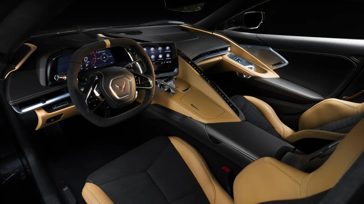
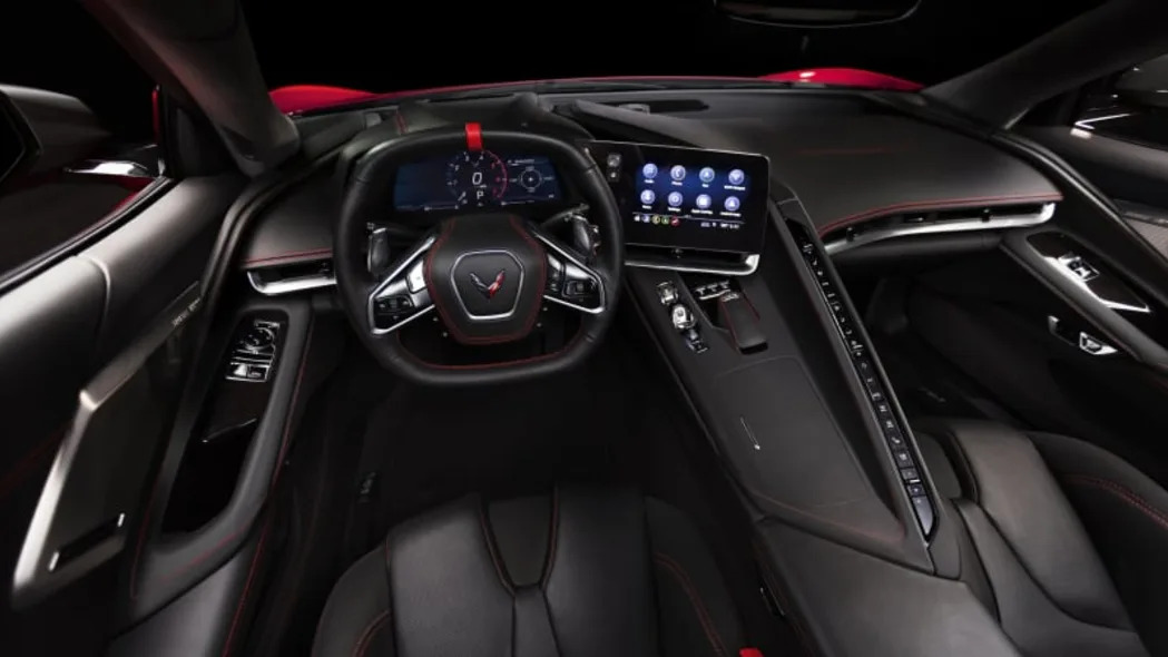
Some of the main things were lowering the instrument panel (IP), making a better cockpit structure around you, making visibility greater, telling an aesthetic story that goes from the front to the rear and the rear to the front, and making sure that everything flows and is kept moving. But the main standpoint was making it the ultimate driving experience for the driver and having it be this full-on embracement of mid-engine architecture.
What are some advantages over the C7?
The main thing is wider visibility, so you can see the road that surrounds you. The pillars are sort of pulled back and around the driver. The other standpoint is camera placement for the rear side, because blind spots aren’t nearly as dramatic as they are on the C7.
You’ll instantly notice how low the IP is. Comparatively, the C7’s is more upright, more traditional, for lack of a better term. This really lowers and pushes down closer to you and gives you full visibility of the road. People were very worried that you weren’t going to see the frunk area enough, but that’s very much still a part of our aesthetic. It drives down through it, but you follow it right down into the road from the IP, it’s pretty incredible.
How did the quality change between the C7 and C8?
Technically, we’re utilizing the same leather, but there’s just more of it. Starting on C7, Nappa leather is predominantly what’s on the up-level vehicles. The difference is we conveyed a strategy where we’re able to do more of it. So when you get an up-level car, it’s a fully wrapped leather vehicle from seats to doors to lowers to IP uppers, suede pillars, everything. Which is slightly similar to the C7, but it’s just embracing it more.
The other thing that really elevates it in the sense of the leather usage is every stitch that you see on there is genuine to what needs to happen to make that piece. Sometimes you draw some beautiful shapes, but not every shape can be wrapped in leather. Leather is a natural material that has to bend and stretch and flex around corners and how you sew that changes how it looks. So, from the beginning, we embraced shapes that really celebrate wrapped pieces.
One of the main areas is the passenger-side IP. That’s a massive piece of leather. It has a rectangular seam near the windshield, and that’s just embracing the airbag. We didn’t try to hide it. If there is going to be a seam there, we wanted to celebrate it and make it beautiful and part of the quality. Same thing on the door. If you look at the door lower, there’s this beautiful french seam that goes from the front to the rear that just follows the flow of the form. Same story. We knew we needed to split the material somewhere to have it taught and wrapped nicely, so we embraced it and made it a part of the aesthetic.
One of the other things we did was up the thickness of our thread throughout the whole car. This might be an internal number that might not resonate, but it was a 135 gauge, now it’s 210. Generally speaking, 210 is what you would see on a Euro stitch on a steering wheel, which needs to be thicker to hold the leather around the rim. And we knew by going to that, it was an upgrade in quality but also makes the thread more of a visual of the interior. So on certain interiors like black leather with red, yellow, or blue stitching, that becomes a major piece of the visual of the car. We were really excited to take advantage of that simple change.
How did you decide to make that change?
Myself and Ryan Vaughan had spent time on C6, C7, and now C8, and that was something that we tried to do in the middle of C7. The reason we wanted it is pretty much what I laid out. We wanted a stronger visual. It provides a lot of depth in a simple way. It elevates the way you interpret the interior, and the way it feels is such a haptic tie to what the quality is.
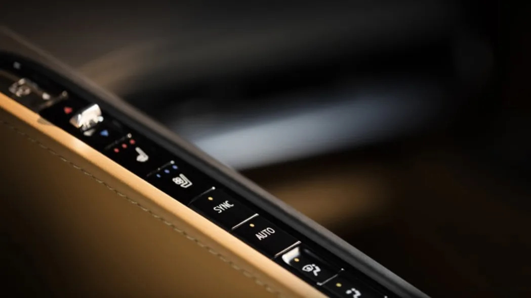
How did the team arrive at the single row of buttons in the middle?
Very similar to how we just discussed the rest of the interior. A lot of it became about placement and functionality of what was around the driver. As we sat there, we knew we wanted to have tactile buttons. We didn’t want to go completely digital with it. When you look at the theme, we wanted it to be that cockpit piece, and it just flows naturally right along that beam. So it became about angling it properly, making it look like it was intended to be there, and following the ergonomics of how you visualize it.
How did you decide on the infotainment screen placement and location?
Depending on how you like your screens or where you look at them in many other vehicles, my personal opinion is that they can look dainty or like they’re going to break off. They can just look like a rectangle shoved into a shape. Here, we didn’t want it to be overbuilt or soft and delicate. If you look from the gauge layout to where the screen is, it naturally flows where your visibility lies. And the shape just took its own form from there. … There’s no denying that screens are here to stay for the foreseeable future, so it’s best to embrace them now and make them a part of your design philosophy, as opposed to creating an interior and putting a screen on top of it.
How does the C8 carry on traditions of previous Corvettes?
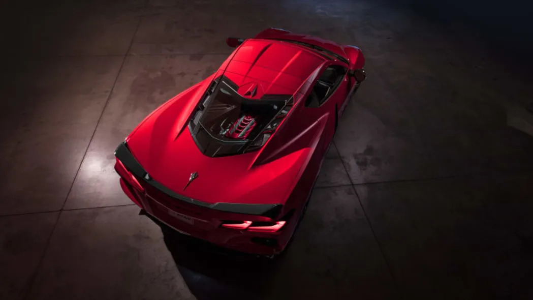
My personal opinion with the Corvette, or with any product that has a long lineage, is you have to embrace where you’ve been, and you have to take it further. So, when I look at this one, the exterior palette has Torch Red, Arctic White, Blade Silver, Black, all of those are colors that have been 100 percent part of the portfolio for years. Those are just colors we don’t mess with, especially Torch Red. It’s the most iconic color we have on the car. So that is something we will not be moving or changing in the near future or any time, for that matter, unless something dramatic happens. So you embrace that. It’s your brand, it’s your heritage, it’s who you are.
Then you pick those areas you need to update and need to finesse. One of those areas was the yellow. Yellow is a color that’s always bright and bold and has an opinion, but it’s also a color that evolves pretty quickly. You don’t want that to stay stagnant, because yellow dates itself. So when we went into the racing team, what we wanted to do was create a yellow that was always visible, something that you could always see. We did a lot of color theory around it, and we found the area that’s the softest point to the human retina. So as it’s going around the track, it should be the most visual piece on the track that you’re always following. Basically, we added a little more blue, and it’s supposed to give you a high visibility feel that pulls you in.
When we went to the interior, we knew we had certain colors from C7 that are thriving. C7 was really exciting in the sense that we had great success with color. A lot of people stereotype the industry like, “you do a black, you do a gray, you do a tan," but we really want to tell a story with every color. You want it to be important to what the car is. And we started that with C7.
We had a few hits that went really well, and the Adrenaline Red interior is one of those. The Grand Sport Collector Edition with the Tension Blue and Jet Black really took us into a new space. When we were creating that package, which was roughly 2013-2014, we had a lot of reactions like, “that’s really bold.” It had a lot of statements around it, it made people anxious, but it sold out. We sold every version of that. We got a lot of excitement from people you might not typically know as somebody who would buy that color. So those little wins give you leverage.
When we were coming into Zerv, we wanted to maintain that type of theory. We knew we were going to carry over Adrenaline Red because it’s becoming iconic to the car. Adrenaline Red on the C7 was interesting. Forty-eight percent of the time it was ordered, people also selected the Arctic White exterior and black wheels, so we saw a package that was already framing of how people viewed it.
There was another one that we wanted to do that enables these theme packages that were kind of hidden within the Corvette system on C7. We wanted to make it a greater visual. One of them was Morello Red. Another one was Natural tan, which you can do two ways: with black or fully dipped. The dipped one really celebrates everything that’s incredible about that interior: hand-stitched, all leather, all of those elements just coming together in this beautiful color.
The other one was building off that Grand Sport, and also tying into the heritage of the C6 60th Anniversary Edition with that Twilight Blue. Those two interior colors, Tension Blue and Twilight Blue, are colors that thrive really well on their own. We let them go away for a little bit, and we wanted to bring them back in a unique way. So we paired them together, and that combo gave it this really exotic approach to the car.
It’s that color story that was the theme for the sketch that really signed off the interior when we were like, “we see something special about this.” We knew we had to maintain that going forward. And the Tension Blue highlights the cockpit pieces, it flows around you and pulls you into the IP and back out the windshield, and it gives it this two-tone exotic luxury space. It’s a very exciting interior.
With no manual option, there's a bit more freedom for design. How did you guys pick the push-button type of shifter?
We wanted something that has depth and something where you know you’re shifting into gear. We wanted that button to have some weight behind it. We wanted it to have a feeling of interaction, and you knew that you were engaging into your driving. We really honed in on that with the strength of the button, the feel of the button, and how it interacts with what you do. So we knew knew we wanted it to be an engagement of the activity of what you were about to do.
How did that change the design of the center console?
We do a lot with our customers to learn and better our understanding of building a vehicle that’s best for our consumers. We knew that this was a sensitive subject, it always is, doesn’t matter what car. Going away from manual is always an interesting conversation. We wanted to make sure we had the right look and feel but also make sure the customer still has the ultimate driving experience they’re looking for.
A lot of that is ergonomics and how it feels, so we put a lot of time and energy and effort into the shape of the wristpad. Basically, where the hand is going to rest and interact with the interior. We were focusing on making a surface that feels good to the hand, has great haptic, and has a great touch using various types of leather. There’s a Nappa leather version and there’s suede.
Anything else you’d like to add?
What’s most exciting about this car is the options for anybody to build what’s right for them. There are more than 11,000 different build combinations. I really love that we’re able to embrace an interior and exterior combination that tells a holistic story. I think that’s important in this vehicle, and I hope everybody enjoys being able to do that.
Featured Gallery 2020 Chevrolet Corvette Interior


 View 25 Photos
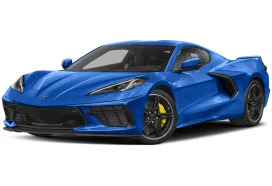

Sign in to post
Please sign in to leave a comment.
Continue