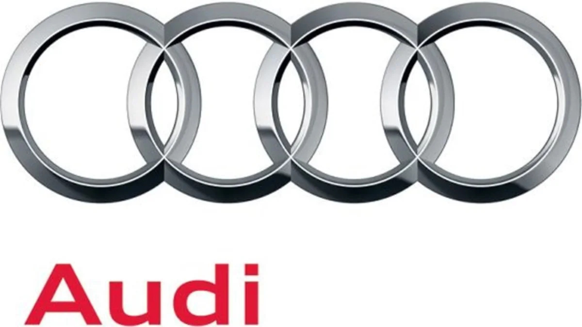
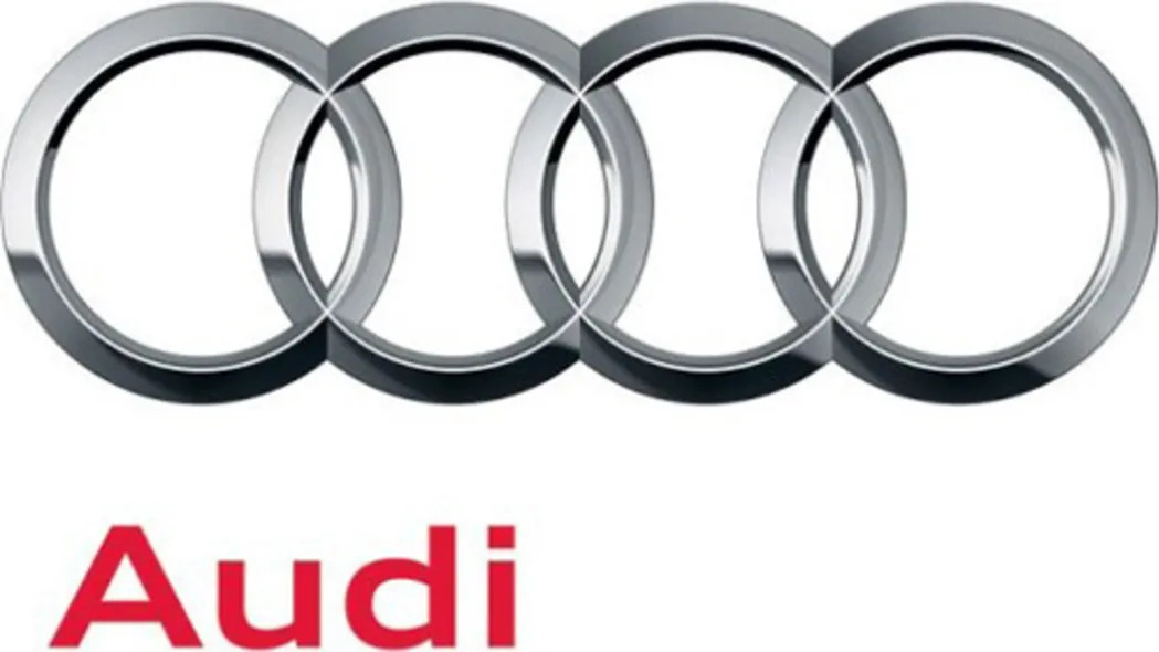
The four-ringed logo has been in use since the Auto Union days back in the 1930s, so we wouldn't expect Audi to go changing it too drastically, but it has given the logo a fresh take to mark the occasion of the company's centenary.
Following the lead taken by other automakers, the subtly revised Audi logo is more chrome-tastic and three-dimensional than the one it replaces. The Audi name has also changed to a more conventional font instead of the backswept typeface, and the name, when appearing next to the ring emblem, has moved away from the center to the bottom left corner. A subtle change, for sure, but a change nonetheless. Click on the thumbnails below to compare the old and new emblems to discern the differences for yourself.


Sign in to post
Please sign in to leave a comment.
Continue